Showing posts with label Year 1. Show all posts

Wednesday, 11 April 2012

Hand 2 Hand or Hand To Hand? (Illustrator)

HAND TO HAND


As I mentioned before we've finally settled on a name for our fictional company and that is "Hand To Hand". I've been struggling to conjure up some basic ideas for this company. Drawing is not my forte, so having to incorporate a hand image into the logo has definitely been slowing me down. Luckily I'm surrounded by some very helpful members in my graphics group. Someone stumbled across a few images on leaflets on the floor and kindly took pictures and sent them to me. Here are the images I was sent. 
I'm thinking of creating logos that are similar to these but I'm trying to avoid creating anything too cliché and obvious. A hand based logo can quite easily end up looking very bland or go the opposite direction and look too complex. I want to create a series of initial ideas with hand images just so I at least have an idea of what I want. I've been looking back at my research of Barney Bubbles work and so far, I haven't thought of anyway to incorporate his designs into my work. Instead, I've just gone ahead and drawn up a few ideas of my own but so far, I'm only pleased with a few of them. Here's an image of some of the ideas I may take into consideration for my final logo. 

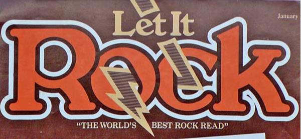
Although, I was finding it difficult to incorporate some of Barney Bubbles work into my own, I later found an image of one of his logos. The logo was a simple typography based logo with a thick boarder. The last two logos you see in my image are some ideas of my own that I created after using Bubbles logo as inspiration. Here's an image of Bubbles logo I used.


This week, we gathered as a group to discuss how an idea can develop from something complex into something simple and professional. Here's a site that I've been looking at that was introduced to us during that session. I quite like this site because I was able to see how this designer easily created his logo by similar adding small shapes and removing certain areas. I explained before that I was finding it difficult to create a logo that wasn't too complex and this site was a great example of how I should work with my initial ideas.  http://www.ideabook.com/tutorials/logo_design/stepbystep_logo.html 

Researching Logos & Barney Bubbles!

Research & Barney Bubbles
My group have finally decided on a name for the fictional company and it's "Hand To Hand". Frankly, I'm not too sure about the name but it's a title that could be quite fun to work with in terms of logo design. At the moment, I'm researching a series of logo designers. I'm in need of some inspiration because I feel like I'm lacking greatly in that area! 


So far, I've been looking at a series of popular logos for courier companies. As you can see in this image, the moment I typed in "Courier Logos" into the search engine, I got an overwhelming amount of results. It was just some very brief research in order to get an idea what kinds of logos were popular within the delivery business industry. 
I've also been looking at a great deal of old designers from the sixties and seventies era because I want my logo to have a classic but timeless feel to it. I'd like to go for something vintage and different! Whilst doing some research, I discovered an artist known as Barney Bubbles. I was looking for a vintage artist that produced excited designs and Barney Bubbles is definitely the sort of designer I'm looking for. His work is very radical and reflects the art style of the early seventies and late sixties, which I like very much. Here are some examples of his work. Although, he's more famous for his liberal visual art and design, I've still decided to use him as inspiration!
Blockhead watch - box open 3  

It's a great coincidence that I found the image of Barney Bubbles hand collage design. I may try creating a logo that starts off as a collage and then perfect it on the computer. I'm still trying to figure out how I'll incorporate his style into my designs. Bubbles is famous for using bright colour, odd shapes and having a space like feel to his designs. I think that I'm rather limited because I still have to consider what my "company" does; and this is a delivery service. Despite the fact that I'm eager to create something vibrant and abstract, I want to ensure that the logo is still presentable and relates to the company name. 

An Imaginary Company? (Final Major Project)

The Final Major Project!

We've finally been given our end of year project and so far, I'm quite excited about it. We've been told that for the next few weeks, we're going to be working purely on corporate design for companies. As I have mentioned before, over the last few months, I haven't been as in tune with some of our projects as I was in the previous semester. 
But, for this project, I'm almost certain that it's something I'll work on with ease. I've done work like this before during my A Levels and I'm hoping to incorporate some of the current skills I already have into my work. 
For the project, we have been split into two groups that are expected to bring forward a pitch for a fictional courier company who wish to keep their trading name "top secret"! We're responsible for helping this company develop a brand new trading name as well as designs for a new rebrand. Therefore we have to create logos, marketing material, etc.
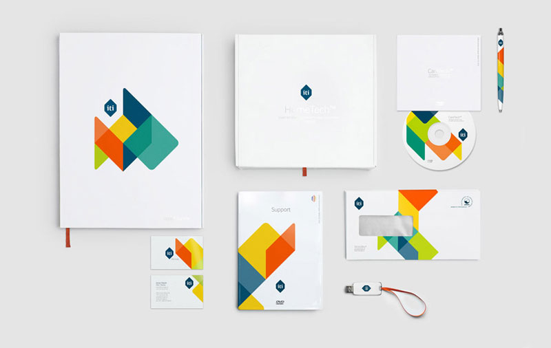
 I haven't been thinking of any design ideas yet for my logo because we haven't been given a name yet but here's an example of the sort of branding we'll have to do for our project. 
The image is just an example of the sort of work we'll have to do. I've always be one for consistency and organisation so something like this really captures my interest. In terms of research, I'm hoping to conduct enough in order to get a specific idea of how corporate design works and the history of courier delivery services. Through this kind of research, I'm also hoping to see if there may be some sort of pattern in branding design history. I may come across some interesting designs from the past that I could incorporate into my ideas. 
I'm currently looking into the work of some designers that have a vintage feel about them because I want my initial ideas to look classic and vibrant. A logo shouldn't be too complex or hard to understand but it still needs to stand out and look eye catching. 
Because we don't have a name yet for our group, I've been using the spare time we have until then to look through some fascinating books based on business logos and letterhead work. These books are called "Letterhead & Logo Design 9" and "Logo Design" by ED. Julius Wiedemann. These books are saturated with inspirational designs and ideas that I'll need for my project. Here are a few images of logos and letterheads from the books that caught my attention. 


Tuesday, 10 April 2012

Easily Influenced (Researching Designers)

Researching Designers


We've been spending quite a lot of time researching logos and trying to understand what explicit and implicit logos are. I'm still not entirely sure how one would be able to identify what kind of logo is explicit or implicit but through some thorough research, I'm starting to understand some areas of this topic. 
I've been doing a lot of research into various designers in order to get some influence for my latest project. In an earlier post, I mentioned that I was doing a mini project based on a list of fictional companies. We were given the task of creating a logo for each of those companies. I have started doing some personal research into the kinds of logos I'd like to create. Designers that I've been very fascinated with lately have been Paul Rand and Herb Lubalin. 
Here's a few images that I copied from the internet into my research folder. Below is an image of some of the work of a designer called Herb Lubalin. I'm very familiar with his work but lately I have been doing some more research into his designs. This is because a lot of the logos that he has created look like the kind of designs I want to create for my logo. The logos you see in the image below are just a small selection of his most popular work. You can see that most of the logos incorporate the image of the title into the actually logo and he does this quite cleverly. I'm hoping that I'll be able to do something similar for my logo. 

Another logo designer that I've been researching is Paul Rand. Most of the members of my group have been researching the work of Paul Rand which is why I thought it would be interesting to see why everyone found him so fascinating. Here's an image of some of the logos that I have been looking at. 
After doing some research, I discovered that a lot of his designs are definitely something I would like to incorporate into my future work. His logos are colourful, exciting and also quite timeless. So farm his NEXT logo and IBM logo have been my favourite. They look vintage, colourful and understandable. This is exactly the sort of idea I'm aiming towards.
                                             

I've started redesigning a lot of my logos after doing some brief research into other designers work. Personally, I've been feeling that some of my designs haven't been as high in quality as they could be. Therefore, doing this basic research into the designs of other artists really gave me the inspiration I needed.
I'm also trying to look into some new artists also. This is so that I can get a fresh look designs instead of having to look at something I'm too familiar with. 


Screen One (Logo Design) Week 5

Logo Design

We were given a short series of company titles to choose from in order to create logos of our own. Out of the six titles, I chose "Screen One". This is because Screen One sounded like TV channel or Cinema. I decided that it definitely sounded like something to do with media and television so I did some brief research into media logos and found that not many of them caught my interest. I've been experimenting with some basic typographic logos and so far this is what I've designed. 
I'm always very wary of the quality of my work, therefore, I asked a member of the group to advice on my logos and I was told that the logos looked similar to the BBC logo. The BBC logo is for a TV channel and if I'm assuming that my logo is for a TV channel then maybe something similar to the BBC channel isn't a bad thing. 
I've been experimenting with a variety of colour using Photoshop as my design aid in the mean time. So far, I created some very basic looking logos. Here's an example of some of the initial design ideas I've created using Photoshop. As you can see, the logos look very simple and almost boring. Although, this is the sort of look most TV channels tend to go with, I wasn't very happy with the outcome of the logo. After some further experimenting, I went ahead and created a new logo and ended up using my first initial idea. Here's an example of some of the logos that I created. 
       
You can see that the logo almost looks like the BBC logo! Although, this wasn't my aim, I found it very interesting. I'd like to develop this further in my spare time because I'm sure that with these two logos, I'll be able to create something interesting. I may incorporate numbers into the logo to make it look more interesting. 
So far, many of my designs have been plain, basic and safe. I'm trying to be more exciting in terms of designs and initial ideas. This logo design task was an opportunity to do this but in the end, I still went ahead created something. I'm sure that for the next project, I'll try and create something more appealing and vibrant. 

Messing With Shapes (Illustrator)

Illustrator


We were given the opportunity to get to know illustrator a bit more by ourselves. This was just so we got an idea of how to mix basic shapes together in order to create a brand new one. I'm still not entirely confident with Illustrator because the features are all very new to me. When I'm able , I do invest some time into getting to know Illustrator a lot better but I'm still not progressing as fast as I'd like to.
In order to create a brand new shape, we were shown how to use a feature known as the "Shape Builder" tool which is a tool that enables you to create a brand new shape by simple connecting basic shapes together. I found this to be an incredibly useful tool, especially since we'll be creating logos of our own in the future.
As I mentioned before, I'm still trying to get the hang of things so I opted for a simple shape to make and decided to create the Ace of Spades. I used very basic shapes to create the spade and here's an image of the final designs. As you can see, it's not entirely finished ad it needs many adjustments but so far, I'm quite pleased with the turn out. I wasn't expecting to come this far with the shape but it wasn't too bad. 
From this session, I've learnt how to use the shape builder tool quite well but not perfectly yet. I'm certain that I'll be using this tool to create my logos some time in the future. I've come to realise that my sessions with Illustrator have been the most challenging for me because a lot of it's features requires skill and thorough concentration. I'm hoping that I'll get used the software in good time because I'd really like to use it in the future. 


Update: I've recently gotten used to using illustrator and I'm currently working on a final major project for the end of the semester. I'm currently trying to create a 3D sort of shape used lines and squares and here's an image of what I've been doing so far. 

I'm hoping to create something more professional and tidy looking. But from the image, you can see that I'm experimenting with the shapes and lines.I'm trying to create cube shapes using the skills I've developed over the past few weeks and so far I'm quite happy with the results! 


Lets Get Professional! (InDesign)

InDesign

This session was spent learning how to use as many features of InDesign as possible. I'm starting to become more accustomed to Indesign and it's features. I'm more than certain that I'll be using it quite often in year 2 so I'm trying to get used it as quickly as possible. 
Here, we were learning how to use the text feature of Indesign. I honestly thought that it would be a lengthy and tedious process learning how to use each and every text feature but to my surprise, it was interesting as well as enjoyable. There was a great deal of text styles to use, especially for those who wish to create a tidy and well designed leaflet, magazine spread or brochure. Here's an image of the list of text styles I experimented with during this session. I also tested out some of the text box and paragraph features just so I could get an idea of how it worked. I had always assumed that most of InDesign was just like Microsoft Word because of the layout and similar features but after some experimenting, I discovered that this software was a lot more useful for what I'd like to do in the future. 


Here's another image of the features I was learning to use in Indesign. Like I mentioned before, the features looked a lot similar to that of Microsoft word which is why I grew so used it quickly. Each feature created some kind of an interesting effect to my selected text. 
After the entire group had become used to the text features, we moved on to another feature which is know as the "Tabs Tool". This is used to organised the positioning of text in a document. It's more like a text aligning tool. 
Unfortunately, I didn't quite understand how to use this tool. Although, I'm still practising in my own personal time because I'm sure that this tool will definitely be useful to me some time in the future. You can see in the image, that I didn't quite align any of the sentences together because the tool was rather difficult for me to use. I'd like if we could come back to this session again just so I can fully understand how to use it. 


In this image, you can see that I was learning to use the paragraph and ruler tool. This wasn't something that we necessarily had to do but I wanted to understand how to fit text into a certain shape. So far, I think I understand how to do this but only to a certain extent. Overall, this session was definitely a useful opportunity for me to learn how to use InDesign further 

Making Leaflets (InDesign)

InDesign

We spent this workshop session learnng how to create a three page leaflet using Indesign. Before we got started, we did a quick activity (sort of a trial run) that involved folding a plain sheet of paper into a three page leaflet. This was just so we could get an idea of what we were doing and how we would fold the real leaflet once we printed it out. Of course, it took all of us a considerable amount of time to actually understand how to fold the leaflet! However, it was still quite fun to take part.
I definitely enjoyed this session because paper engineering is something that I find extremely interesting. I've always been curious about the digital process that takes place when creating a professional leaflet or brochure. This session was a great opportunity for me to finally understand how it all works. We used InDesign to create our leaflets, although I'm sure there are many other design software that is used but using Indesign was a great opportunity for us to develop our skills. 
In order to create the leaflet, we used Indesign and the ruler guide feature to measure the areas of the leaflet that will be the pages. Here's an image of what the leaflet looked liked on the screen before I finally printed it out. 
We were give the liberty to design the leaflet as we wanted as long as it was a three page leaflet. As you can see, some of the pages of the leaflet on the screen are upside down. this is because when i print it out and fold it, the pages will be back to back. Although the layout of this page looks quite simple, I found it a little challenging to get the measurements and text perfect in order for it to look professional. 
Hopefully, in our future workshop sessions, we'll be given the opportunity to create more leaflets such as this. I'd really like to develop my skills in paper engineering and possible build on my interest further. Here are some images of the leaflet when I finally printed it out!

Monday, 9 April 2012

Mid Semester Review and Quick Catch Up! Week 7

Mid Semester Review


We did a mid semester review this week and although it's not my favourite part of the semester, I was still quite eager to present my work as rapidly as possible! We were all expected prepare a seven minute presentation and present our work to everyone in a formal manner. Unfortunately, only a few of us were able to present our work using a power point presentation. Hopefully, by the end of the semester, we'll all be more prepared and confident enough to present a formal presentation. 
This mid semester review was a chance for everyone to get together and discuss how we've been getting on with our mini projects in preparation for the final major project. I've learnt quite a bit from every other member in the group. Everyone has produced a substantial amount of work which has actually motivated me to start producing a lot more work also. In my presentation, I only showed the work that I assumed was necessary to show and then explained in to the rest of the class when needed. 
I assume that this mid semester review was more or a less a trial run for when we do the real the thing at the end of the semester. 
Not much has taken place this week. We've all been very busy getting on with our current projects and preparing for the final major project. Hopefully, we should start that project very soon because I'm curious to know what we'll be doing! 

Monday, 20 February 2012

Smells Colourful (Perfume Box Designs) Week 4

Perfume Box Designs

For this next fortnight project, we've been researching into the idea of words and phrases relating to certain colours. Colour has the potential to associate itself to certain places, words and even objects. For this short project, we're expected to use our creative thinking in order to understand how colour can evoke certain reactions and feelings. In order to show our understanding of how this works, we must draw up a perfume boxes using a series of titles given to us. The colours within the boxes have to relate to the title of the perfume and this is something I found quite challenging. 
I did some brief research into the sort of perfume boxes that I'd like use use as inspiration and so far, I haven't found anything that particularly captures my interest. 
With this project, I haven't exactly produced as much as I should have, nor have I created anything that exciting or fully complete. So far, I've been experimenting with typeface and it's colours in order to get on with the project. I've decided to use the titles, Paris and Poison in order to designs some perfume boxes. I chose these titles for my designs because I knew it would give me the opportunity to create something classy and simple. 
Here's an example of some of the basic research I did. I found a few images of perfume bottles that were quite simple but still vibrant in colour and design. As you can see, I found a high-street perfume box design and thought it looked like exactly what I wanted to create. The colours are summery and soft which personally reminds me of Paris. Therefore, I thought I'd try to incorporate a similar design into my perfume box designs. As I mentioned before, I found this project was slightly tricky because we all view things differently. I may think that bright colours remind me of Paris, whilst someone else might not. 


Here are a few examples of the sort of boxes that I created this week. I chose to use patterns such as swirls and stripes because these are the sorts of designs that I've seen during my research. You can also see that I have chosen to work with both very bright colours as well as dark colours that I felt illustrated Paris quite well. I'm not as satisfied with the designs as I'd like to be. The typeface choices work well with the colours but the over look of the perfume boxes aren't as professional as I would like them to be. I'm definitely going to come back to this project again in order to create something more sophisticated and in relation to what the project specification actually requires. Overall, it was interesting to work with colours for this project but it not as simple as I had assumed it would be. 

Friday, 3 February 2012

Let's Make Music...Albums (InDesign) Week 3

InDesign

The workshops this semester have been focused on InDesign and getting comfortable with it's features. So far, I've really enjoyed using InDesign. I've been quite comfortable with it because some of it's features are similar to that of Microsoft Word. Because of this, I've been able to adjust to it quite quickly. 
For this session, we were expected to create simple album covers but using a fun method to find the name, image and album title. This was done using, Wikipedia, a quotes and poetry site and an image sharing site. It was definitely an enjoyable session because we were all creating covers that were not planned ahead and each cover we made had to look random!
In order to create the covers, we had to open up InDesign and use the default album cover size setting. From there, we were free to create the album cover as we like. Here's an image of what my album covers turned to look like. 
In case you can't read what the images say, the first album cover is by "Battle Of Beaumont" and their album is called "Nature Replaced It With". The second is by "Frankie Lymon" and his album is called "Destroy the United States". Of course, these are all names and titles that were randomly picked from the internet. I thoroughly enjoyed working with InDesign during this session. 
I'm more than certain that our future projects will consist of magazine layout design work and I'm looking forward to that. Now that I've gotten to know Adobe Indesign a little better, I have some idea as to how to create a basic magazine layout. I may use Indesign for some areas of the current project that we're working on. For now, I'd still like to understand some of the features a lot better. 
I've decided to look into purchasing Indesign over the summer just so I can spend some time getting to know it a lot  better by myself. Honestly, this software has become my favourite design aid so far! 

BANG, CrAcK, splash!! (Onomatopoeia) Week 2


Looks Like The Sound!

This week, we've been focusing on creating fonts and designs that represent a certain sound. 
This is known as onomatopoeia. Again, we just have to use a little imagination to conjure up some design ideas that represent a sound. I've chosen a series of onomatopoeic words that I want to attempt to design and in all honesty, it's a lot more challenging than I anticipated!
I chose the words Crack and Puff because I knew they would be the most interesting words for me to mess around with. Because I wasn't entirely sure how would go about using positive and negative effects into my designs, I went ahead and did some basic research. Here's an image of the sort of designs I assumed we were supposed to do with our choice of onomatopoeic words. With the designs that  have created, I have started to lean towards these sorts of designs.
I'm trying to experiment with typography without having to incorporate imagery into it. This is more of a personal way for me to learn to work with letters without having to depend on images to make it look aesthetically pleasing. I thoroughly believe that this project was a great way for me to do this. So far, I've been working with some positive and negative effects in my work in order get some interesting designs in my onomatopoeic words. 
Here's an example of what I've been working with. As I mentioned before, I've chosen the words, Crack and Puff. Because the word puff, sounds like something soft and fluffy, I decided to trace around some cloudy font in different ways in order to create some interesting effects. To my surprise, I was actually quite pleased with some of the outcomes. The cloudy effects really illustrated the word "Puff" to a great extent. I went ahead and played around with some of the shape and isolated some parts in order to get more interesting effects. Unfortunatley, I didn't capture the image too well with my camera. But from the image, you can see that I have been a little spontanaous with the way I have messed around with positive and negative designs. I'm still trying to use Sanna Annuka as an inspiration for my logo design projects because I admire the way she works with shapes. I hope that some of the ways I have been working reflect this. If I do come back to this project, then I'd like to experiment with a wider range of onomatopoeic words and possibly some colour.

Tuesday, 3 January 2012

Initials (Initial Ideas & Research) Week 1

Initial Ideas & Research
We have now moved on from the previous semester to the next and we're working on something different. It's more or less the same as our positive and negative project but this time we're focusing on logos. We're expected to gather a lot more information in whatever area of graphics we're working on in our projects. Last semester, I was a lot more interested in producing work of my own rather than researching other artists in order to gather more information and inspiration. 
The first project of the semester is about representing nouns by using words and graphics. This is something that I am definitely comfortable with because we simply have to use our imagination and a little common sense to achieve a decent design. The first 2 week project we're doing consists of just simple initial ideas. We are expected to select the initials of people that we admire and use them to create something more vibrant and interesting. It's almost as if we're creating a personal logo for them. 
Again, we're being encouraged to use the skills we learnt during our positive and negative project to create whatever designs we have in mind. We were told to incorporate all those skills into our works and to just to see what happens. 
For a short while, I have been using the internet as my main source of research. For this project, I would like to broaden my source of information in order to get the most out of it as I can. But in the mean time, I have found plenty of information in journals. A woman known as Sanna Annuka has been a huge inspiration of mine, especially for this project. She's quite popular for her distinct Native American like patterns in her designs. She's quite spontaneous in terms of the way she uses positive and negative effects in her designs. 
I've decided to try and create some odd positive and negative designs of my own too using the initials of people that I admire. I chose Jesus Christ, Marilyn Monroe and Beyonce Knowles. For the the initials of Jesus Christ, I tried to clash the crucifix in with the initials but the designs were not coming out in a way that I would have liked. On the left, is an image of some of the results I got. I'm not very pleased with these designs because I felt as though they came out too simple and the quality isn't as great as I would like it to be. 
I went ahead and tried to work with some other inspirations of mine. Marilyn Monroe is another inspiration because she's such an iconic figure and a great example of how amazing the 50s were! I tried to incorporate some typical Hollywood symbols and images into her initials whilst still sticking to the positive and negative designs. Here's an example what I came out with. All of the designs were okay in terms of quality but I am not entirely happy with the way some of them came out. Some were too complex and others seemed to be too simple. I experimented with as many designs as I could conjure up but none seemed to come out the way I would have liked.
If I still have some spare time near the end of the semester, I would like to come back to this mini project and spend some time experimenting with the initials. Hopefully, by then I'll have some more vibrant and imaginative ideas. 


Friday, 9 December 2011

It's History (Typography Timeline)

Research, Reading & Illustrator Designing

Recently, we have been learning a lot about Typography and it's origins. In the past I spent most of my AS levels learning about the origins of Fashion, art pieces and other Art related areas. So, I have found these seminars to be quite interesting. 
After our typography seminars, we were given a two week project to complete over the Christmas holidays I've gone ahead and conducted some research of my own in order to find out a bit more about typography. We needed to add information given to us during the seminars plus the information we gathered ourselves. I used the internet a lot more than books because I felt that it was easiest source I could get to for information at the time. I was able to find a sufficient amount of historicals facts that I think is relevant to the project. I'm hoping that what I am including in the poster will not be useless because I did collect an abundance of information therefore, I'm unsure as to whether or not I should include it. 
In terms of designing the timeline, I was unsure as to how I should present my information, what it should look like and what I should include in the poster. I have finished the poster a little while ago but I am still unsure about the presentation. It's plain, simple and you can see the information clearly. I was unsure whether or not I needed to add a wealth of images therefore I decided to only add relevant images that related to the most important facts. Here, you can see my Typography History timeline.
As mentioned before, it's quite basic and looks very simple. I wanted to make sure I was including more information rather than images because we told to give information. 
If I had a little extra time, then I would go back and redesign the entire timeline to make it more aesthetically pleasing. But if I did make it look more interesting then I may not have had enough space to add information. I


Before I even started designing the timeline, I did some research in timeline designs and here are some of the designs that appealed to me the most. This first one seemed to make the most sense to me so I wanted to create a timeline similar to it. It's plain and does what it's supposed to do; present information. 

This next one is similar to the one yo see above. As I researched further, I noticed that most the timeline designs were all the same so I decided to lean towards the growing ages line design. I thought that instead of having my timeline horizontal like these designs, I would have mine vertical so that I'd have enough space to place information. At the time, this seemed to work best for me but as I researched further and found other images of timeline, I started doubt the look of my poster. 


In the end, I decided that the information I added would be from the seminar and from the information that I gathered myself. Although I am not entirely happy with the way I designed my timeline, I prefer it this way because I have presented more information that images. 

Book Worms (Magazine and Book Layouts) 05/11/11

Magazine and Book Layout Designs

These past couple of sessions have been spent talking about book covers and magazine layout. This is something that I have always been interested in since sixth form. I've always been curious to know how books and magazines are published and what goes in to the production before creating an entire book cover. For the next few weeks, we will be working on some book covers and magazine layouts of our own. I'm going to be using a few magazines and books as inspiration. 
Last week, were instructed to pick some titles out of a long list given to us and these were the tiles I chose to use because U assumed they would be the easiest to work with:

  • COOL DUDES
  • Haute Couture 
  • California
  • Archaos
  • Pop Art

Because I have grown so used to designing with a computer over the past years, I have decided to try and continue working in my sketch book and layout pad using only pen and paper so I can learn to draw and plan better. Here are some images I of the lard thumbnail sketches I did before I decide to design them on the computer. 
So far, I'm quite enjoying Book cover designing even though I haven't gotten round to designing anything totally solid on the computer. I'm sure I will be able to create something by the end of this week using Illustrator and Photoshop.
I've also been researching a variety of Book cover designers these past few days and I've come across an urban artist know as Jeff Hendrickson. He designed a book cover that I cam across online during some research. The book was called "Doing The Dead"; you'll see it on his website. His work is all very commercial and professional which is something I might like to do one day but not right now. The book cover design that Hendrickson designed was very plain but still eye catching, which I liked. Here is a link to his Blog site: http://www.jeffhendricksondesign.com/blog/
Here is an image of the book cover that I saw. 

This is the sort of cover I'm aiming for. Something simple and not to wild. 
I haven't thought too much about magazine layouts yet because I've been concentrating a lot on book covers. I have photocopied and researched a variety magazine layouts that I want to analyse and use as part of my project. 

Update:
I've started creating some front covers of my own because I was quite eager to get started. Here you can see that I have created my first book cover using Photoshop. This cover was created for the book title Cool Dude. It's very basic but I believe it subtly illustrates the title. I chose a black background because black is usually associated with gangs, night life, clubbing and  all sorts of negative things. Then I chose make the letters connect to each other so that it would illustrate a group of close friends. The bright colours of the letters made it, I think, slightly more interesting to look at because busy colours is something that mainly associated with youth. The image beside it what I wanted to use in case I wanted an underline. 

Magazines: 


Because I needed some inspiration, I visited the Library on occasionally in order to find spread outs of magazines. I found a few layout Ideas from journals such as Creative Review and other journals. I chose to focus on the layout pages of creative review because this journal is the only one with square shaped pages unlike other magazines that have rectangular (A4) pages. I have not started my magazine layout analysis yet but I will conduct some more research so I'm sure what I'm doing.  

Lets Get 3D!! (3D Design in Illustrator) 07/12/11

Lets Get 3D!


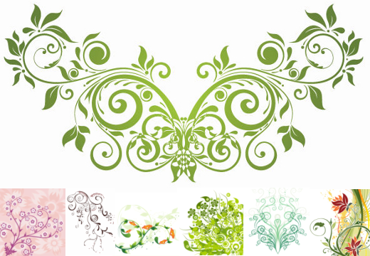
We're still working on Illustrator during our workshop sessions but it's getting a lot more interesting than I expected. We spent today's session working with illustrator to create funny looking shapes. We intended on creating actuall objects and sticking titles of Christmas messages on them, but because I am still trying to figure out how to use the vectoring tool, I still haven't gotten round to creating any recognisable shapes yet. Here, you can see an image I found online of the sort of shapes that can be created using Illustrators 3D tool and the vectoring tool.

Here, you can see that I was trying to create a heart shape, but instead ended up making what I think looks like an apple shape falling into pools of red. Despite the fact, that they didn't come out as I intended, they were still fun to make. In my opinion, the 3D tool seemed to make everything look a lot more interesting. I used it to create half a dozen more shapes because I found it to be quite an enjoyable tool to just mess around with. I had no idea what I was doing but eventually I ended up with the image you see below. 


I created a candle in a candle in a candle holder so that I could finally add a Christmas message to an image. The only problem was the image was too thin and I didn't scale it very well. However, I think I have finally gotten the hang of using the vector tool on Illustrator. This will come in very useful for any future projects that I may have. Here are some other images that I created using simple words and Illustrators 3D tool. From this image, you can see that this was my first attempt at using the 3D tool and it did not come out as well as I had hoped. 


Tuesday, 29 November 2011

Vectoring! (Illustrator) 23/11/11

Working with Illustrator again

Again, We've been using our workshop sessions to work on illustrator in order to create interesting and odd images.
What is is vectoring - Vectoring is something used to create lines, curves and in most cases shapes, using Illustrator. This is a great tool to use when trying to design and create your own shape. Here's an example of an images that was traced using the vectoring tool. You can see that the vectoring tool is very useful for making complex shapes. 
This session was spent using Illustrator to create simple fonts. We were instructed to play what was supposed to be a "quick" puzzle game that consisted of instructions in order to create the word "VECTOR". Unfortunately, I was one was one of the last few to finally get the hang of the game but I eventually got round to it. Here is an image of the word that I drew using Illustrators vectoring tool.


In future, I'm sure I'll find the tool a lot more useful but for now I'm just trying to work with the skills I currently have because I'm still finding illustrator quite tricky.