Tuesday, 3 January 2012

Initials (Initial Ideas & Research) Week 1

Initial Ideas & Research
We have now moved on from the previous semester to the next and we're working on something different. It's more or less the same as our positive and negative project but this time we're focusing on logos. We're expected to gather a lot more information in whatever area of graphics we're working on in our projects. Last semester, I was a lot more interested in producing work of my own rather than researching other artists in order to gather more information and inspiration. 
The first project of the semester is about representing nouns by using words and graphics. This is something that I am definitely comfortable with because we simply have to use our imagination and a little common sense to achieve a decent design. The first 2 week project we're doing consists of just simple initial ideas. We are expected to select the initials of people that we admire and use them to create something more vibrant and interesting. It's almost as if we're creating a personal logo for them. 
Again, we're being encouraged to use the skills we learnt during our positive and negative project to create whatever designs we have in mind. We were told to incorporate all those skills into our works and to just to see what happens. 
For a short while, I have been using the internet as my main source of research. For this project, I would like to broaden my source of information in order to get the most out of it as I can. But in the mean time, I have found plenty of information in journals. A woman known as Sanna Annuka has been a huge inspiration of mine, especially for this project. She's quite popular for her distinct Native American like patterns in her designs. She's quite spontaneous in terms of the way she uses positive and negative effects in her designs. 
I've decided to try and create some odd positive and negative designs of my own too using the initials of people that I admire. I chose Jesus Christ, Marilyn Monroe and Beyonce Knowles. For the the initials of Jesus Christ, I tried to clash the crucifix in with the initials but the designs were not coming out in a way that I would have liked. On the left, is an image of some of the results I got. I'm not very pleased with these designs because I felt as though they came out too simple and the quality isn't as great as I would like it to be. 
I went ahead and tried to work with some other inspirations of mine. Marilyn Monroe is another inspiration because she's such an iconic figure and a great example of how amazing the 50s were! I tried to incorporate some typical Hollywood symbols and images into her initials whilst still sticking to the positive and negative designs. Here's an example what I came out with. All of the designs were okay in terms of quality but I am not entirely happy with the way some of them came out. Some were too complex and others seemed to be too simple. I experimented with as many designs as I could conjure up but none seemed to come out the way I would have liked.
If I still have some spare time near the end of the semester, I would like to come back to this mini project and spend some time experimenting with the initials. Hopefully, by then I'll have some more vibrant and imaginative ideas. 


Friday, 9 December 2011

It's History (Typography Timeline)

Research, Reading & Illustrator Designing

Recently, we have been learning a lot about Typography and it's origins. In the past I spent most of my AS levels learning about the origins of Fashion, art pieces and other Art related areas. So, I have found these seminars to be quite interesting. 
After our typography seminars, we were given a two week project to complete over the Christmas holidays I've gone ahead and conducted some research of my own in order to find out a bit more about typography. We needed to add information given to us during the seminars plus the information we gathered ourselves. I used the internet a lot more than books because I felt that it was easiest source I could get to for information at the time. I was able to find a sufficient amount of historicals facts that I think is relevant to the project. I'm hoping that what I am including in the poster will not be useless because I did collect an abundance of information therefore, I'm unsure as to whether or not I should include it. 
In terms of designing the timeline, I was unsure as to how I should present my information, what it should look like and what I should include in the poster. I have finished the poster a little while ago but I am still unsure about the presentation. It's plain, simple and you can see the information clearly. I was unsure whether or not I needed to add a wealth of images therefore I decided to only add relevant images that related to the most important facts. Here, you can see my Typography History timeline.
As mentioned before, it's quite basic and looks very simple. I wanted to make sure I was including more information rather than images because we told to give information. 
If I had a little extra time, then I would go back and redesign the entire timeline to make it more aesthetically pleasing. But if I did make it look more interesting then I may not have had enough space to add information. I


Before I even started designing the timeline, I did some research in timeline designs and here are some of the designs that appealed to me the most. This first one seemed to make the most sense to me so I wanted to create a timeline similar to it. It's plain and does what it's supposed to do; present information. 

This next one is similar to the one yo see above. As I researched further, I noticed that most the timeline designs were all the same so I decided to lean towards the growing ages line design. I thought that instead of having my timeline horizontal like these designs, I would have mine vertical so that I'd have enough space to place information. At the time, this seemed to work best for me but as I researched further and found other images of timeline, I started doubt the look of my poster. 


In the end, I decided that the information I added would be from the seminar and from the information that I gathered myself. Although I am not entirely happy with the way I designed my timeline, I prefer it this way because I have presented more information that images. 

Book Worms (Magazine and Book Layouts) 05/11/11

Magazine and Book Layout Designs

These past couple of sessions have been spent talking about book covers and magazine layout. This is something that I have always been interested in since sixth form. I've always been curious to know how books and magazines are published and what goes in to the production before creating an entire book cover. For the next few weeks, we will be working on some book covers and magazine layouts of our own. I'm going to be using a few magazines and books as inspiration. 
Last week, were instructed to pick some titles out of a long list given to us and these were the tiles I chose to use because U assumed they would be the easiest to work with:

  • COOL DUDES
  • Haute Couture 
  • California
  • Archaos
  • Pop Art

Because I have grown so used to designing with a computer over the past years, I have decided to try and continue working in my sketch book and layout pad using only pen and paper so I can learn to draw and plan better. Here are some images I of the lard thumbnail sketches I did before I decide to design them on the computer. 
So far, I'm quite enjoying Book cover designing even though I haven't gotten round to designing anything totally solid on the computer. I'm sure I will be able to create something by the end of this week using Illustrator and Photoshop.
I've also been researching a variety of Book cover designers these past few days and I've come across an urban artist know as Jeff Hendrickson. He designed a book cover that I cam across online during some research. The book was called "Doing The Dead"; you'll see it on his website. His work is all very commercial and professional which is something I might like to do one day but not right now. The book cover design that Hendrickson designed was very plain but still eye catching, which I liked. Here is a link to his Blog site: http://www.jeffhendricksondesign.com/blog/
Here is an image of the book cover that I saw. 

This is the sort of cover I'm aiming for. Something simple and not to wild. 
I haven't thought too much about magazine layouts yet because I've been concentrating a lot on book covers. I have photocopied and researched a variety magazine layouts that I want to analyse and use as part of my project. 

Update:
I've started creating some front covers of my own because I was quite eager to get started. Here you can see that I have created my first book cover using Photoshop. This cover was created for the book title Cool Dude. It's very basic but I believe it subtly illustrates the title. I chose a black background because black is usually associated with gangs, night life, clubbing and  all sorts of negative things. Then I chose make the letters connect to each other so that it would illustrate a group of close friends. The bright colours of the letters made it, I think, slightly more interesting to look at because busy colours is something that mainly associated with youth. The image beside it what I wanted to use in case I wanted an underline. 

Magazines: 


Because I needed some inspiration, I visited the Library on occasionally in order to find spread outs of magazines. I found a few layout Ideas from journals such as Creative Review and other journals. I chose to focus on the layout pages of creative review because this journal is the only one with square shaped pages unlike other magazines that have rectangular (A4) pages. I have not started my magazine layout analysis yet but I will conduct some more research so I'm sure what I'm doing.  

Lets Get 3D!! (3D Design in Illustrator) 07/12/11

Lets Get 3D!


We're still working on Illustrator during our workshop sessions but it's getting a lot more interesting than I expected. We spent today's session working with illustrator to create funny looking shapes. We intended on creating actuall objects and sticking titles of Christmas messages on them, but because I am still trying to figure out how to use the vectoring tool, I still haven't gotten round to creating any recognisable shapes yet. Here, you can see an image I found online of the sort of shapes that can be created using Illustrators 3D tool and the vectoring tool.

Here, you can see that I was trying to create a heart shape, but instead ended up making what I think looks like an apple shape falling into pools of red. Despite the fact, that they didn't come out as I intended, they were still fun to make. In my opinion, the 3D tool seemed to make everything look a lot more interesting. I used it to create half a dozen more shapes because I found it to be quite an enjoyable tool to just mess around with. I had no idea what I was doing but eventually I ended up with the image you see below. 


I created a candle in a candle in a candle holder so that I could finally add a Christmas message to an image. The only problem was the image was too thin and I didn't scale it very well. However, I think I have finally gotten the hang of using the vector tool on Illustrator. This will come in very useful for any future projects that I may have. Here are some other images that I created using simple words and Illustrators 3D tool. From this image, you can see that this was my first attempt at using the 3D tool and it did not come out as well as I had hoped. 


Tuesday, 29 November 2011

Vectoring! (Illustrator) 23/11/11

Working with Illustrator again

Again, We've been using our workshop sessions to work on illustrator in order to create interesting and odd images.
What is is vectoring - Vectoring is something used to create lines, curves and in most cases shapes, using Illustrator. This is a great tool to use when trying to design and create your own shape. Here's an example of an images that was traced using the vectoring tool. You can see that the vectoring tool is very useful for making complex shapes. 
This session was spent using Illustrator to create simple fonts. We were instructed to play what was supposed to be a "quick" puzzle game that consisted of instructions in order to create the word "VECTOR". Unfortunately, I was one was one of the last few to finally get the hang of the game but I eventually got round to it. Here is an image of the word that I drew using Illustrators vectoring tool.


In future, I'm sure I'll find the tool a lot more useful but for now I'm just trying to work with the skills I currently have because I'm still finding illustrator quite tricky.  

Learning Something New (Illustrator & Journals) 20/11/11

Illustrator & Journals

We spent a good few hours learning a few simple things on Adobe Illustrator this lesson. I personally prefer Photoshop as it's a software that I'm used to working with in terms of design. However, after some perseverance and patience, I have grown to like Illustrator. We spent our lesson learning how to create certain images using only simple shapes, colours and lines. This was quite a challenge for most of us as the shape we were instructed to create was the Ying Yang symbol. 
Here is an image of what a typical Ying Yang symbol looks like. After a long time, mine came out looking exactly like this image (with some help). We were then instructed to create something out this image, using the same skills we learnt to create the Ying Yang symbol. 


Here is an image of the things I created out of my Ying Yang symbol in the the end. I thought some little aliens and owls best suited the shapes I was working with. I honestly, found this lesson to be quite useful seeing as I have never worked with Illustrator in the past. 


I personally believe that I take a while to master a new software so this was quite challenging for me. Although, as a Graphics student, I'm aware that one needs to be able to understand certain design software in order to be successful in the modern art world. I've decided that I will be using Illustrator in the future; possibly for Typography projects as this seems to be the best software for this area. 
After taking part in these sessions, I have started reading the Creative Review and Grafik journals. I did this because I wanted some ideas for my positive and negative project. Plus, I needed to get to know as much information in my chosen area of practice before the end of the semester. I noticed that I wasn't as informed in graphics as some of the others in my class so looking through a few journals, gathering ideas and learning about graphic design seemed to be the best thing to do. 

Tang Yao Hoong 20/11/11


Positive and Negative Artists!

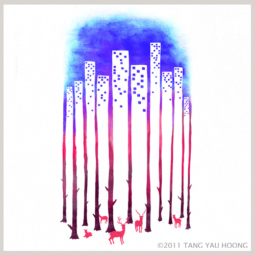
Recently, we've been focusing on positive and negative art by a variety of artists. The artist which I have been focusing on the most lately has been a popular young man named Tang Yao Hoong. The reason why Hoong has drawn most of my attention towards his work is because a lot of his pieces are quite bold and rich in vibrancy which is something that I am trying to achieve in my work.
Here, you can a see an of some of his earliest work that I have come across while researching him via the internet. Unfortunately,  I haven't gotten round to creating something as clever or complex as Hoong has but I am working on some things of my own. 
I have been researching other artists as well but, for some reason, most of the work that I find via the internet is usually scattered. This means that I find bits and pieces of work but I never seem to come across the actually designer of the work. The only person I discovered so far is Tan Yao Hoong. However, there has been a lot of good to come out of this because now I know exactly what I want to get out of this mini project. In case you're wondering what some the rest of his work looks like, I have placed a link here, so you can get a better look at his gallery. This link takes you directly to a folder of his work that I adore the most. http://tangyauhoong.com/negative-space/
Here are a few quick designs that I did in my layout pad that I think were successful to some extent. I'm trying to be more open minded with my designs as I tend to stick one specific sort of design for period of time, which can get boring. Like, I mentioned before, they were all just some quick fonts that I conjured up because I wanted to see how many positive and negative designs I could design in the last 10 mins I had of lesson. 
I also mentioned that I wanted my work to lean in Tan Yao Hoongs direction because I would like to have something bright, colourful and eye catching in my flip folder. Because I have not gotten round to buying some coloured markers yet, I decided to print some abstract pictures in A4 size and use them for patterned letters. Her is an example of my first attempt at doing this. 


I plan on doing some more positive/negative designs over the Christmas holidays once I have finished doing some research. But so far, I have come to be quite comfortable with this area of graphic design. Unlike some of the other areas I have dabbled in, Positive/Negative designing is actually enjoyable.