Tuesday 29 November 2011

Vectoring! (Illustrator) 23/11/11

Working with Illustrator again

Again, We've been using our workshop sessions to work on illustrator in order to create interesting and odd images.
What is is vectoring - Vectoring is something used to create lines, curves and in most cases shapes, using Illustrator. This is a great tool to use when trying to design and create your own shape. Here's an example of an images that was traced using the vectoring tool. You can see that the vectoring tool is very useful for making complex shapes. 
This session was spent using Illustrator to create simple fonts. We were instructed to play what was supposed to be a "quick" puzzle game that consisted of instructions in order to create the word "VECTOR". Unfortunately, I was one was one of the last few to finally get the hang of the game but I eventually got round to it. Here is an image of the word that I drew using Illustrators vectoring tool.


In future, I'm sure I'll find the tool a lot more useful but for now I'm just trying to work with the skills I currently have because I'm still finding illustrator quite tricky.  

Learning Something New (Illustrator & Journals) 20/11/11

Illustrator & Journals

We spent a good few hours learning a few simple things on Adobe Illustrator this lesson. I personally prefer Photoshop as it's a software that I'm used to working with in terms of design. However, after some perseverance and patience, I have grown to like Illustrator. We spent our lesson learning how to create certain images using only simple shapes, colours and lines. This was quite a challenge for most of us as the shape we were instructed to create was the Ying Yang symbol. 
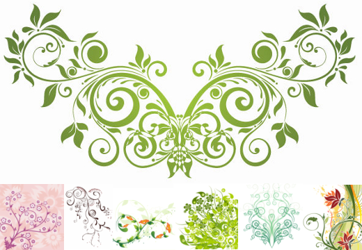
Here is an image of what a typical Ying Yang symbol looks like. After a long time, mine came out looking exactly like this image (with some help). We were then instructed to create something out this image, using the same skills we learnt to create the Ying Yang symbol. 


Here is an image of the things I created out of my Ying Yang symbol in the the end. I thought some little aliens and owls best suited the shapes I was working with. I honestly, found this lesson to be quite useful seeing as I have never worked with Illustrator in the past. 


I personally believe that I take a while to master a new software so this was quite challenging for me. Although, as a Graphics student, I'm aware that one needs to be able to understand certain design software in order to be successful in the modern art world. I've decided that I will be using Illustrator in the future; possibly for Typography projects as this seems to be the best software for this area. 
After taking part in these sessions, I have started reading the Creative Review and Grafik journals. I did this because I wanted some ideas for my positive and negative project. Plus, I needed to get to know as much information in my chosen area of practice before the end of the semester. I noticed that I wasn't as informed in graphics as some of the others in my class so looking through a few journals, gathering ideas and learning about graphic design seemed to be the best thing to do. 

Tang Yao Hoong 20/11/11


Positive and Negative Artists!

Recently, we've been focusing on positive and negative art by a variety of artists. The artist which I have been focusing on the most lately has been a popular young man named Tang Yao Hoong. The reason why Hoong has drawn most of my attention towards his work is because a lot of his pieces are quite bold and rich in vibrancy which is something that I am trying to achieve in my work.
Here, you can a see an of some of his earliest work that I have come across while researching him via the internet. Unfortunately,  I haven't gotten round to creating something as clever or complex as Hoong has but I am working on some things of my own. 
I have been researching other artists as well but, for some reason, most of the work that I find via the internet is usually scattered. This means that I find bits and pieces of work but I never seem to come across the actually designer of the work. The only person I discovered so far is Tan Yao Hoong. However, there has been a lot of good to come out of this because now I know exactly what I want to get out of this mini project. In case you're wondering what some the rest of his work looks like, I have placed a link here, so you can get a better look at his gallery. This link takes you directly to a folder of his work that I adore the most. http://tangyauhoong.com/negative-space/
Here are a few quick designs that I did in my layout pad that I think were successful to some extent. I'm trying to be more open minded with my designs as I tend to stick one specific sort of design for period of time, which can get boring. Like, I mentioned before, they were all just some quick fonts that I conjured up because I wanted to see how many positive and negative designs I could design in the last 10 mins I had of lesson. 
I also mentioned that I wanted my work to lean in Tan Yao Hoongs direction because I would like to have something bright, colourful and eye catching in my flip folder. Because I have not gotten round to buying some coloured markers yet, I decided to print some abstract pictures in A4 size and use them for patterned letters. Her is an example of my first attempt at doing this. 


I plan on doing some more positive/negative designs over the Christmas holidays once I have finished doing some research. But so far, I have come to be quite comfortable with this area of graphic design. Unlike some of the other areas I have dabbled in, Positive/Negative designing is actually enjoyable.

Tuesday 8 November 2011

Out With The Old, In With The New! (Negative & Positive Space) 07/11/2011

Negative & Positive 
Space

Today, we spent a short period of time presenting our work to the class. I went last to present mine and gave a brief description to the class about what I did and why I chose to do each piece. I think that the next time we do have a presentation such as this one, I'll come more prepared. This is because I felt that I could have given a lot more detail. On the left is an image of all of the students work presented on the wall. Mine is among them somewhere in the centre. We were told to research about other artists a lot more when working on any kind of project. I have taken this on board and have decided to buy a folder in order to keep track of anything useful that I find online or anywhere else.  Overall, I think that a lot of my work came out successful. In future, I would like to be more prepared for any kind of presentation.  Here are images of some of the work that I produced for the project in the end. The second to last one was an A5 poster illustration my "Internal Environment" and the final one was a collage that I created using the left over pieces of work that I had. 

We spent a short amount of time discussing positive and negative space in graphic design. I have never heard of positive and negative space so I know it's definitely something I want to research into further. We looked at an artist known as Noma Bar. He specialises in positive and negative space designs which I personally think are very clever and sort of urban. I definitely want to research his work further. On the right are a few examples of the sort of work that he does. Even though each piece of work I've seen of his comes across as clever, I believe that he's actually having fun with what he's doing. He's using positive and negative space in a way that no one would think of. 
So, this is what we will be spending the next four weeks doing. We will be using a set of markers and pens given to us to create positive and negative designs of our own. I hope to achieve some decent designs by the end of this project. 


Bringing It All Together (Finalising Project) 03/11/2011

Finalising My Project

Although we were told that this project was merely a foundation for our up coming solid project, I thought it would be good to put in as much effort as I could into proving what I felt I was capable of producing as a student graphic designer. 
I used Journals such as Computer Art and Creative Review for inspiration. I was able to access these books from the Filton Library as I was unable to get to the Bower Ashton Library. I conjured up a lot more ideas looking through Creative Review than I did looking at the Computer Art Journal from some reason
Here, you can see how I have developed my paper engineering peice that I mentioned in an earlier post. . You can see how the triangle has equal angles which means that when it's folded, all the images come together without looking messy. Unfortunately, when I finally folded the up the leaflet, there were still corners sticking out and some of the edges did not look as neat as I would have liked it to. 
Here, you can see what the image looks like once it's been folded out. Because I decided to use this leaflet as an illustration for my "Visual Journey", I tried to make it look as if it was folding out into a path. Sadly, I was unable to make it into a longer path because I felt that I was struggling slightly with the little I had. Although, there were some minor issues when working with this leaflet, I still felt that it came out well and I'm happy with the result. Seeing as I spent a large amount of time on this leaflet, I believe that it came out quite successful. I hope to work with paper engineering again some time in the future because, to my surprise, I found it interesting and challenging. I've developed new skills through using creating this leaflet so I would really like to attempt this once again. 
Here are some more images of my leaflet from different angles. 


I have definitely benefited a lot from the book I mentioned in an earlier blog, Paper Engineering. From the book, I was able to master some basic folding techniques. Folding is part of a hands on approach to Graphic Design which something that I'm not entirely used to. But, as I read the book a little more and started experimenting with one or two techniques in my spare time, I grew to enjoy Paper Engineering.