Tuesday 25 September 2012

Giambattista, The Creator of Bodoni

Bodoni Typeface Research

Today has been spent looking at the history of the Bodoni Typeface. So far, I found that the Bodoni typeface is one of the oldest typeface designs that I'm researching so far. The typeface was created by an Italian engraver known as Giambattista Bodoni in 1798. 
According to my research, the Bodoni typeface "drew upon the influences of the older serif Baskerville face to produce a font which was seen as being more pleasing on the eye." Another source I used as research mentioned, "Bodoni drew inspiration from elements of the English typeface Baskerville and the French typeface Didot, with the result widely-regarded as one of the most influential and easily-recognized typefaces in history"


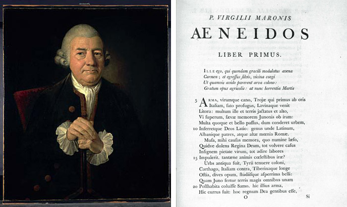
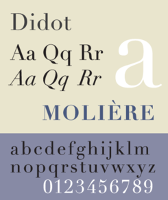
Here's an image of what the older Baskerville typeface (and the Didot typeface) looked like before Giambattista recreated it. Bodoni was interested in recreating the typeface and making it look more aesthetically pleasing and useful. 

DidotSP.png

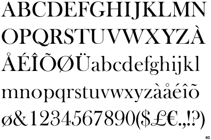
Here's an image of Bodoni's typeface design. At first glance, I didn't notice a difference between the two typeface designs, Baskerville and Bodoni. It wasn't until I did some further analysis and research that is I discovered their differences and similarities. 

                                       Bauer Bodoni

Whilst researching I discovered an image showing the difference between the two designs. Looking at this image, you can see that Bodoni's design is a lot more defined and sharp. Most of his letters have pointed tales and look thinner in some areas. 
"His type was characterised by a severe simplicity. In his influential Manuale Tipografico of 1818, he laid down the four principles of type design 'from which all beauty would seem to proceed', which were: regularity, cleanness, good taste, and charm." I found this quote on a site that described why he decided to create such a clean and simple typeface. According to most of the research I've done, Bodoni's design is known as a modern typeface. 
"his design held sway throughout the 19th century. In 1907, Morris Fuller Benton recut Bodoni (BT) which is still in use today"

John, The Creator of Baskerville

Baskerville Type Research

Recently, I've been researching into the history and development of the Baskerville type design. Before I started looking into it more specifically, I had already done some brief research into it due to the fact that Giambattista Bodoni had used this typeface as inspiration for his design, Bodoni. This type face was created by an artist known as John Baskerville.
"Baskerville, designed in 1754, is most known for its crisp edges, high contrast and generous proportions. The typeface was heavily influenced by the processes of the Birmingham-bred John Baskerville, a master type-founder and printer, who owed much of his career to his beginnings". After some thorough research into the history of this typeface, I came across a short list of the characteristics of Baskerville. These are points that I probably wouldn't have been able to notice myself:
Identifying Characteristics
  •  tail on lowercase g does not close
  •  swash-like tail of Q
  •  small counter of italic e compared to italic a
  •  J well below baseline
  •  high crossbar and pointed apex of A
  •  top and bottom serifs on C
  •  W and w have no middle stroke
  •  long lower arm of E
  • Many version feature a calligraphic J
  • T has wide arms

Here's an image of what the Baskerville image looks like. 
I haven't yet looked into some important key words for my typography project. But according to my research the Baskerville typeface was something developed due to technology and was known as a transitional typeface. "John Baskerville. Baskerville, who had made a fortune in japanning before turning to printing when in his mid forties, was responsible for several advances in printing technology, improving press platens and packings, formulating darker and faster-drying inks, and inventing wove paper, which was smoother than the old laid papers with their vertical ribbing. all of this enabled him to employ a typeface with sharper definition and thinner elements than was previously possible. This marks the move from the "garalde" to the transitional faces." 

John Baskerville (Source: Birmingham Museum); Virgil Aeneid with expansive margins and fine alignment, 1757 (Source: Typefaces for Books)

This is an image I found of is earliest works used in books. 
"Baskerville is categorized as a transitional typeface in-between classical typefaces and the high contrast modern faces. At the time that John Baskerville decided to switch from owning a japanning business to a type foundry, Phillipe Grandjean’s exclusive Romain du Roi for Louis XIV had circulated and been copied in Europe. The mathematically-drawn characters felt cold, and prompted Baskerville to create a softer typeface with rounded bracketed serifs and a vertical axis." Like many of the other type designers I have looked at, John was inspired by another typeface to create his own. 
Here's an image of how Baskerville is used in today's modern works:
Baskerville in use: The Metropolitan Opera logo by Pentagram, poster by Bradley Hoston, Kate Spade New York logo, Better Homes and Gardens magazine, Canada wordmark, Baskerville ampersand from The Ampersand letterpress poster, Baskerville Type greeting card, American Gangster 2007 film poster, Baskerville on iPhone

Sunday 16 September 2012

Barry, The Creator of Template Gothic

Template Gothic Research

I have started researching into the history and orientation of the Template Gothic Typeface. This was definitely the most difficult typefaces to research due to the fact it is one of the latest typeface's to date. It's unfortunate that I couldn't find much information via the internet, so I will be making a trip to Bower Ashton Library in search of extra information. 


So far, The creator and Designer of Template Gothic is Barry Deck. Here's an image of what Template Gothic looks like:

I found this interesting quote from a website, describing the digital era of typeface and design during the nineties. "In the early 1990s, as digital design tools began supporting the seamless reproduction and integration of media, many designers grew dissatisfied with clean, unsullied surfaces, seeking instead to plunge the letter into the harsh and caustic world of physical processes. Letters, which for centuries had sought perfection in ever more exact technologies, became scratched, bent, bruised, and polluted." 
Due to the ever changing interests of the design world, Barry Deck was able to use this as inspiration in order to create something rough and grungy. I know that the nineties was a very rough and grungy era in search of something different and Barry Deck's typeface design certain fit into the era appropriately.
The image above perfectly illustrates what the nineties were about and the cultural change in the western world. Things were more rough and daring and I love how the image about titles the entire design as "I am not perfect"/

Friday 14 September 2012

Max & Eduard, The Creator Of Helvetica

Helvetica Typeface

Lately, I've been researching the history and orientation of the Helvetica typeface. Before the beginning of our summer break, we were encouraged to pick a typeface that we found the most interesting and do some more in depth research into it. I've decided that I might focus my attention on the Helvetica typeface.The reason for this is because the Helvetica typeface is one of the youngest typefaces I've research so far. This means that it's quite modern and possible a lot more interesting to research. Here's some information that I've discovered about the Helvetica Typeface. 

"The original Helvetica was designed in Switzerland in 1957 by Max Miedinger and Eduard Hoffmann at the Haas type foundry (Haas’sche Schriftgiesserei). Haas was controlled by the type foundry Stempel, which was in turn controlled by Linotype.
The original name for Helvitica was actually Die Neue Haas Grotesk. It was closely based on a typeface knows as Schelter-Grotesk. The typeface was created to be something safe and basic. "This neutrality was paramount, and based on the idea that type itself should give no meaning"

Here's an image of what the Helvetica Typeface looks like:


"Helvetica is one of the most popular typefaces in the world. Technically speaking, it’s a sans serif Grotesque typeface, inspired by and based on the Akzidenz-Grotesk typeface created by Berthold around 1898." 
This is an image of the original Helvetica Brochure:

I found out that Sans Serif Grotesque means and according to my research, a Sans Serid Grotesque is "The word “Grotesque”, or “Grotesk” in German, is also frequently used as a synonym for sans-serif in typography. At other times, it is used to describe a particular style or subset of sans-serif typefaces. The origin of this association can be traced back to English type founder William Thorowgood, who first introduced the term “grotesque” and in 1835 produced 7-line pica grotesque—the first sans-serif typeface containing actual lower case letters. An alternate etymology is possibly based on the original reaction of other typographers to such a strikingly featureless typeface.
Here's an interesting fact about how the name came about "The marketing director at Stempel decided to change the name to Helvetica in 1960 to make the font more marketable internationally. Originally it was proposed that the typeface be called Helvetia (Latin for Switzerland), but the designers didn't want to name it after a country, and so it was called Helvetica instead (which is Latin for Swiss)"

There have multiple variations of Helvetica; some eve created by other type designers. 

  • Helvetica Light was designed at Stempel by artistic director Erich Schultz-Anker and Arthur Ritzel.
  • Helvetica Compressed was designed by Matthew Carter that’s similar to Helvetica Inserat, but with a few differences.
  • Helvetica Textbook is an alternate design with a few different characters.
  • Helvetica Rounded was developed in 1978 and includes rounded stroke terminators. It’s only available in bold and black versions (including condensed and obliques), plus an outline version that wasn’t available digitally.
  • Neue Helvetica was developed in 1983 and has more structurally unified heights and widths among its characters. It also has improved legibility, increased spacing in numbers, and heavier punctuation marks.

Helvetica was originally designed during the post war in Europe and many companies were looking for a change. People had become bored of the swirly and fancy looking typeface and so they wanted something more corporate, modern and stronger. 


According to my research, Helvetica can be compared to the typeface, Ariel. Here's some information that found written by Cameron Chapmen:

Compared to Arial

"Arial is a very similar font to Helvetica, and was developed in 1982. To an untrained eye, the differences between the two fonts is almost undetectable. But there are key differences among certain characters, notably G, R, r, t, a, and 3. I Love Typography has a great comparison of how Arial and Helvetica differ. Helvetica is somewhat more refined than Arial, even though each one has the same character width. One of the key differences, though, is in the strokes for each character. Helvetica uses primarily vertical or horizontal strokes, while Arial often uses diagonal strokes. If you’re interested to see if you can tell the difference between Arial and Helvetica, Ironic Sans has a quiz that compares 20 popular logos originally designed with Helvetica redone in Arial and compared. It’s harder than you’d initially think, particularly if those characters mentioned above (with key differences between the two fonts) aren't present in the logos." 

I found this quite interesting because at first glance, I would not have noticed the similarities between both of the typeface. But when placed side by side, you can see the tiny modifactions in certain letters. 

Thursday 13 September 2012

Herb, The Creator of Lubalin

Lubalin Typeface Research
Herb Lubalin is actually one of the few artists I focused on during my third semester of Graphic Design. He was a graphic designer, typographer and type designer. He was also the creator of the typeface, Lubalin Graph. 

"Lubalin Graph, designed by the American graphic designer Herb Lubalin. It's a geometric, slab-serif, that comes in multiple weights". The typeface was originally released in 1974. Here's an image of what Herb's design looks like. 


According to my research, this typeface is actually a Slab Serif ("Slab Serif is a type of serif font that evolved from the Modernstyle. The serifs are square and larger, bolder than serifs of previous typestyles. Considered a sub-classification of Modern, Slab Serif is further divided into") version of his original typeface design, Avant Garde. Like other typeface designers, Lubalin also created a family of sizes for his design. Here's an image of some avant garde font. I can see from this image that it's very similar in size and height. The ITC Lubalin typeface however looks more blocky and strong. 

I came across a site that explains the similarities between the two typefaces. "The 1974 design for ITC Lubalin Graph is based on Herb Lubalin’s earlier design of ITC Avant Garde Gothic. The basic geometric character shapes are identical in both designs, while Lubalin Graph has the added feature of slab serifs. It conveys a strong, no-nonsense look in display type from headlines to packaging.
flag
There isn't all that much online information about the history of ITC Lubanlin Typeface. However I found out plenty of information Herb Lubalin's other designs.

Wednesday 12 September 2012

Paul, The Creator Of Futura!

Futura Research

I've been looking into the history of the Futura Typeface and so far, I've found a lot of information. Futura is actually one of the most commonly used typefaces today and like the previous typeface I researched, Gill Sans, it is also a Sans Serif. 

According to my research, the designer for this typeface is known as Paul Renner. He was inspired by Bauhaus to create this modern typeface. "Following the Bauhaus design philosophy, German type designer Paul Renner first created Futura between 1924 and 1926. Although Renner was not a member of the Bauhaus, he shared many of its views, believing that a modern typeface should express modern models rather than be a rivial of a previous design.

After some further research I found out that Renner's typeface design was actually a more developed version of the design by Jakob Erbar. You can see that in the image below. 
"In 1922, German professor Jakob Erbar created the first ever geometric sans-serif typeface (above). In accordance with the hugely influential Bauhaus school of design, the typeface aimed for a pure functionality, with no ornamentation or individual characteristics. It is based on the circle — the most fundamental of all typographic components — and is supremely easy to read, which is a typeface’s basic function after all."

Seeing as I don't know much about Bauhaus, I went ahead and did some brief research on them and found they were simply an art school but have significant influence on today's modern designs. Here's an image of the typeface family created by Bauhaus:


Here are some images I found of the family of Futura Typeface designs by Paul Renner:


"While designing Futura, Renner avoided creating any non-essential elements, making use of basic geometric proportions with no serifs or frills. Futura's crisp, clean forms reflect the appearance of efficiency and forwardness even today". What I've gathered from this quote is that Renner was eager to create something that looked modern and almost timeless. I'm yet to  understand fully what Serifs and San Serifs are because knowing these key words might be useful to me when creating my own typeface. 

Renner conducted a wide range of experiments before finally settling with one design for his typeface. "Renner's initial design experimented with several geometrically constructed character alternatives and old-style figuresHere's a copy of one of his earliest designs:

Regular & Bold


Futura has been modified by many companies into various versions. 
"The success of Futura spawned a range of new geometric sans-serif typefaces, such as Kabel and Century Gothic, among others. Now over 80 years since its creation, many foundries have released variations of Futura in the digital form, Adobe being the one of the most commonly used. Several international companies also use their own customized version of Futura, including Volkswagen (visible in their renowned advertising) and IKEA."


Tuesday 11 September 2012

Eric, The Creator Of Gill Sans

Gill Sans Research

After doing some brief research, I found quite a bit about the Gill Sans typeface and its background. Gills Sans was originally created by a man known as Eric Gill (Born in Bristol) and was also issued by Monotype in 1928-30. He was inspired to create this font while working for his employer and friend known as Edward Johnston, the creator of the London Underground typeface. 


"Drawing heavily on Johnston’s work, Gill first experimented with his ‘improvements’ in 1926 when he hand-painted lettering for a bookshop sign in his hometown, Bristol." 

I found out that Gill used a lot of Edward Johnston's work as inspiration for his own typography designs. After my research into Gill Sans, I may take a look at some of the work Edwad Johnson, also. After doing some more research, I found that the popularity Gill Sans spread widely during the 1930s. 

"Gill Sans rose to popularity in 1929 when it became the standard typeface for the London and North Eastern Railway (LNER), appearing on everything from locomotive nameplates to time tables."


Image

"The typeface was used in 1935 by designer Edward Young on the now iconic Penguin Books jacket design, putting Gill Sans on bookshelves around the world."
According to my research, Gill Sans is also known as a Humanist Sans Serif. "Humanist sans-serifs is a category used to describe sans serifs that do not appear angular, geometric, or mechanical, whilst being unfussy, forthright, and simple." I'm assuming that a humanist sans-serif is a typeface that is simple but still soft and unique. It's something that doesn't have sharp edges and points, but rather a font with soft curves and corners. Here's an example of a series of Humanist Sans Serifs. 


Gill developed his font a lot more when advertising agencies and businesses became more demanding of unique and distinctive fonts. Here's an image of the family of fonts that he created.


Gill Sans, common weights and styles at 36pt
He explained that his reason for doing this was because "The Gill Sans family ranges from Light to the exaggerated Ultra Bold—“because every advertisement has to try and shout down its neighbors,"

Some further researched has shown me that the Gill Sans font also has some classic Roman proportions to it. This is so that it doesn't have too much of a mechanical feel to it. 

I went ahead and did some brief research on Edward Johnston in order to find out what influenced Eric Gill. Here's an image of a short series of the typeface he created for the London underground logo. You can see that his designs are quite similar to Gill Sans. 


You can see how Gill was able to Johnston's designs and create his own by simple adding a few modifications. I recently read a blog that explains how Eric Gill only used a few adjustments to in order to create his unique font. It explains, "Similar to Johnston’s sans serif, Gill Sans is more refined and distinctive. Eric Gill replaced Johnston’s diamonds over the ‘i’ and ‘j’ with round dots He also simplified the lowercase ‘l’ in comparison to the hooked ‘l’ in Johnston’s alphabet. Notable differences in the uppercase include the open counters in Gill’s ‘S’ and the humanistic stroke and joinery on the tail of the ‘Q’. Gill Sans has points at the base of the ‘V’ and the ‘W’ in contrast with the flat bases of Johnston’s letters


So, by only adding a few adjustments to his designs, he was able to create a completely new typeface of his own. We still use the typeface today and I did some brief research on this fact. Here's a quote from 
 http://idsgn.org/posts/know-your-type-gill-sans/ that I found interesting.

"Today over two dozen Gill Sans designs are available digitally, with mainstream reach thanks to its inclusion on Mac OS X and Microsoft Office. It can be seen everywhere, used (or overused) on everything from corporate logos to movie posters—one industry that has actually embraced the unusual Ultra Bold."