Wednesday 11 April 2012

Hand 2 Hand or Hand To Hand? (Illustrator)

HAND TO HAND


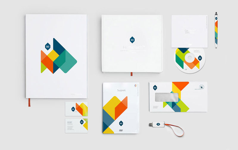
As I mentioned before we've finally settled on a name for our fictional company and that is "Hand To Hand". I've been struggling to conjure up some basic ideas for this company. Drawing is not my forte, so having to incorporate a hand image into the logo has definitely been slowing me down. Luckily I'm surrounded by some very helpful members in my graphics group. Someone stumbled across a few images on leaflets on the floor and kindly took pictures and sent them to me. Here are the images I was sent. 
I'm thinking of creating logos that are similar to these but I'm trying to avoid creating anything too cliché and obvious. A hand based logo can quite easily end up looking very bland or go the opposite direction and look too complex. I want to create a series of initial ideas with hand images just so I at least have an idea of what I want. I've been looking back at my research of Barney Bubbles work and so far, I haven't thought of anyway to incorporate his designs into my work. Instead, I've just gone ahead and drawn up a few ideas of my own but so far, I'm only pleased with a few of them. Here's an image of some of the ideas I may take into consideration for my final logo. 

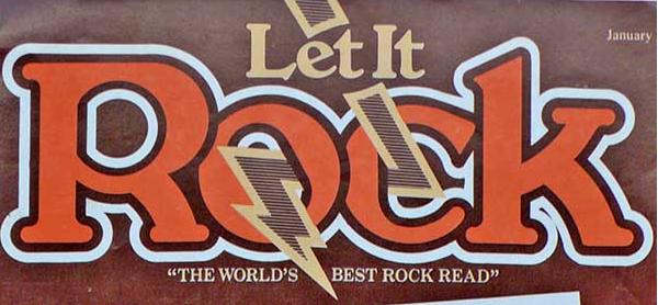
Although, I was finding it difficult to incorporate some of Barney Bubbles work into my own, I later found an image of one of his logos. The logo was a simple typography based logo with a thick boarder. The last two logos you see in my image are some ideas of my own that I created after using Bubbles logo as inspiration. Here's an image of Bubbles logo I used.


This week, we gathered as a group to discuss how an idea can develop from something complex into something simple and professional. Here's a site that I've been looking at that was introduced to us during that session. I quite like this site because I was able to see how this designer easily created his logo by similar adding small shapes and removing certain areas. I explained before that I was finding it difficult to create a logo that wasn't too complex and this site was a great example of how I should work with my initial ideas.  http://www.ideabook.com/tutorials/logo_design/stepbystep_logo.html 

Researching Logos & Barney Bubbles!

Research & Barney Bubbles
My group have finally decided on a name for the fictional company and it's "Hand To Hand". Frankly, I'm not too sure about the name but it's a title that could be quite fun to work with in terms of logo design. At the moment, I'm researching a series of logo designers. I'm in need of some inspiration because I feel like I'm lacking greatly in that area! 


So far, I've been looking at a series of popular logos for courier companies. As you can see in this image, the moment I typed in "Courier Logos" into the search engine, I got an overwhelming amount of results. It was just some very brief research in order to get an idea what kinds of logos were popular within the delivery business industry. 
I've also been looking at a great deal of old designers from the sixties and seventies era because I want my logo to have a classic but timeless feel to it. I'd like to go for something vintage and different! Whilst doing some research, I discovered an artist known as Barney Bubbles. I was looking for a vintage artist that produced excited designs and Barney Bubbles is definitely the sort of designer I'm looking for. His work is very radical and reflects the art style of the early seventies and late sixties, which I like very much. Here are some examples of his work. Although, he's more famous for his liberal visual art and design, I've still decided to use him as inspiration!
Blockhead watch - box open 3  

It's a great coincidence that I found the image of Barney Bubbles hand collage design. I may try creating a logo that starts off as a collage and then perfect it on the computer. I'm still trying to figure out how I'll incorporate his style into my designs. Bubbles is famous for using bright colour, odd shapes and having a space like feel to his designs. I think that I'm rather limited because I still have to consider what my "company" does; and this is a delivery service. Despite the fact that I'm eager to create something vibrant and abstract, I want to ensure that the logo is still presentable and relates to the company name. 

An Imaginary Company? (Final Major Project)

The Final Major Project!

We've finally been given our end of year project and so far, I'm quite excited about it. We've been told that for the next few weeks, we're going to be working purely on corporate design for companies. As I have mentioned before, over the last few months, I haven't been as in tune with some of our projects as I was in the previous semester. 
But, for this project, I'm almost certain that it's something I'll work on with ease. I've done work like this before during my A Levels and I'm hoping to incorporate some of the current skills I already have into my work. 
For the project, we have been split into two groups that are expected to bring forward a pitch for a fictional courier company who wish to keep their trading name "top secret"! We're responsible for helping this company develop a brand new trading name as well as designs for a new rebrand. Therefore we have to create logos, marketing material, etc.
 I haven't been thinking of any design ideas yet for my logo because we haven't been given a name yet but here's an example of the sort of branding we'll have to do for our project. 
The image is just an example of the sort of work we'll have to do. I've always be one for consistency and organisation so something like this really captures my interest. In terms of research, I'm hoping to conduct enough in order to get a specific idea of how corporate design works and the history of courier delivery services. Through this kind of research, I'm also hoping to see if there may be some sort of pattern in branding design history. I may come across some interesting designs from the past that I could incorporate into my ideas. 
I'm currently looking into the work of some designers that have a vintage feel about them because I want my initial ideas to look classic and vibrant. A logo shouldn't be too complex or hard to understand but it still needs to stand out and look eye catching. 
Because we don't have a name yet for our group, I've been using the spare time we have until then to look through some fascinating books based on business logos and letterhead work. These books are called "Letterhead & Logo Design 9" and "Logo Design" by ED. Julius Wiedemann. These books are saturated with inspirational designs and ideas that I'll need for my project. Here are a few images of logos and letterheads from the books that caught my attention. 


Tuesday 10 April 2012

Easily Influenced (Researching Designers)

Researching Designers


We've been spending quite a lot of time researching logos and trying to understand what explicit and implicit logos are. I'm still not entirely sure how one would be able to identify what kind of logo is explicit or implicit but through some thorough research, I'm starting to understand some areas of this topic. 
I've been doing a lot of research into various designers in order to get some influence for my latest project. In an earlier post, I mentioned that I was doing a mini project based on a list of fictional companies. We were given the task of creating a logo for each of those companies. I have started doing some personal research into the kinds of logos I'd like to create. Designers that I've been very fascinated with lately have been Paul Rand and Herb Lubalin. 
Here's a few images that I copied from the internet into my research folder. Below is an image of some of the work of a designer called Herb Lubalin. I'm very familiar with his work but lately I have been doing some more research into his designs. This is because a lot of the logos that he has created look like the kind of designs I want to create for my logo. The logos you see in the image below are just a small selection of his most popular work. You can see that most of the logos incorporate the image of the title into the actually logo and he does this quite cleverly. I'm hoping that I'll be able to do something similar for my logo. 

Another logo designer that I've been researching is Paul Rand. Most of the members of my group have been researching the work of Paul Rand which is why I thought it would be interesting to see why everyone found him so fascinating. Here's an image of some of the logos that I have been looking at. 
After doing some research, I discovered that a lot of his designs are definitely something I would like to incorporate into my future work. His logos are colourful, exciting and also quite timeless. So farm his NEXT logo and IBM logo have been my favourite. They look vintage, colourful and understandable. This is exactly the sort of idea I'm aiming towards.
                                             

I've started redesigning a lot of my logos after doing some brief research into other designers work. Personally, I've been feeling that some of my designs haven't been as high in quality as they could be. Therefore, doing this basic research into the designs of other artists really gave me the inspiration I needed.
I'm also trying to look into some new artists also. This is so that I can get a fresh look designs instead of having to look at something I'm too familiar with. 


Screen One (Logo Design) Week 5

Logo Design

We were given a short series of company titles to choose from in order to create logos of our own. Out of the six titles, I chose "Screen One". This is because Screen One sounded like TV channel or Cinema. I decided that it definitely sounded like something to do with media and television so I did some brief research into media logos and found that not many of them caught my interest. I've been experimenting with some basic typographic logos and so far this is what I've designed. 
I'm always very wary of the quality of my work, therefore, I asked a member of the group to advice on my logos and I was told that the logos looked similar to the BBC logo. The BBC logo is for a TV channel and if I'm assuming that my logo is for a TV channel then maybe something similar to the BBC channel isn't a bad thing. 
I've been experimenting with a variety of colour using Photoshop as my design aid in the mean time. So far, I created some very basic looking logos. Here's an example of some of the initial design ideas I've created using Photoshop. As you can see, the logos look very simple and almost boring. Although, this is the sort of look most TV channels tend to go with, I wasn't very happy with the outcome of the logo. After some further experimenting, I went ahead and created a new logo and ended up using my first initial idea. Here's an example of some of the logos that I created. 
       
You can see that the logo almost looks like the BBC logo! Although, this wasn't my aim, I found it very interesting. I'd like to develop this further in my spare time because I'm sure that with these two logos, I'll be able to create something interesting. I may incorporate numbers into the logo to make it look more interesting. 
So far, many of my designs have been plain, basic and safe. I'm trying to be more exciting in terms of designs and initial ideas. This logo design task was an opportunity to do this but in the end, I still went ahead created something. I'm sure that for the next project, I'll try and create something more appealing and vibrant. 

Messing With Shapes (Illustrator)

Illustrator


We were given the opportunity to get to know illustrator a bit more by ourselves. This was just so we got an idea of how to mix basic shapes together in order to create a brand new one. I'm still not entirely confident with Illustrator because the features are all very new to me. When I'm able , I do invest some time into getting to know Illustrator a lot better but I'm still not progressing as fast as I'd like to.
In order to create a brand new shape, we were shown how to use a feature known as the "Shape Builder" tool which is a tool that enables you to create a brand new shape by simple connecting basic shapes together. I found this to be an incredibly useful tool, especially since we'll be creating logos of our own in the future.
As I mentioned before, I'm still trying to get the hang of things so I opted for a simple shape to make and decided to create the Ace of Spades. I used very basic shapes to create the spade and here's an image of the final designs. As you can see, it's not entirely finished ad it needs many adjustments but so far, I'm quite pleased with the turn out. I wasn't expecting to come this far with the shape but it wasn't too bad. 
From this session, I've learnt how to use the shape builder tool quite well but not perfectly yet. I'm certain that I'll be using this tool to create my logos some time in the future. I've come to realise that my sessions with Illustrator have been the most challenging for me because a lot of it's features requires skill and thorough concentration. I'm hoping that I'll get used the software in good time because I'd really like to use it in the future. 


Update: I've recently gotten used to using illustrator and I'm currently working on a final major project for the end of the semester. I'm currently trying to create a 3D sort of shape used lines and squares and here's an image of what I've been doing so far. 

I'm hoping to create something more professional and tidy looking. But from the image, you can see that I'm experimenting with the shapes and lines.I'm trying to create cube shapes using the skills I've developed over the past few weeks and so far I'm quite happy with the results! 


Lets Get Professional! (InDesign)

InDesign

This session was spent learning how to use as many features of InDesign as possible. I'm starting to become more accustomed to Indesign and it's features. I'm more than certain that I'll be using it quite often in year 2 so I'm trying to get used it as quickly as possible. 
Here, we were learning how to use the text feature of Indesign. I honestly thought that it would be a lengthy and tedious process learning how to use each and every text feature but to my surprise, it was interesting as well as enjoyable. There was a great deal of text styles to use, especially for those who wish to create a tidy and well designed leaflet, magazine spread or brochure. Here's an image of the list of text styles I experimented with during this session. I also tested out some of the text box and paragraph features just so I could get an idea of how it worked. I had always assumed that most of InDesign was just like Microsoft Word because of the layout and similar features but after some experimenting, I discovered that this software was a lot more useful for what I'd like to do in the future. 


Here's another image of the features I was learning to use in Indesign. Like I mentioned before, the features looked a lot similar to that of Microsoft word which is why I grew so used it quickly. Each feature created some kind of an interesting effect to my selected text. 
After the entire group had become used to the text features, we moved on to another feature which is know as the "Tabs Tool". This is used to organised the positioning of text in a document. It's more like a text aligning tool. 
Unfortunately, I didn't quite understand how to use this tool. Although, I'm still practising in my own personal time because I'm sure that this tool will definitely be useful to me some time in the future. You can see in the image, that I didn't quite align any of the sentences together because the tool was rather difficult for me to use. I'd like if we could come back to this session again just so I can fully understand how to use it. 


In this image, you can see that I was learning to use the paragraph and ruler tool. This wasn't something that we necessarily had to do but I wanted to understand how to fit text into a certain shape. So far, I think I understand how to do this but only to a certain extent. Overall, this session was definitely a useful opportunity for me to learn how to use InDesign further 

Making Leaflets (InDesign)

InDesign

We spent this workshop session learnng how to create a three page leaflet using Indesign. Before we got started, we did a quick activity (sort of a trial run) that involved folding a plain sheet of paper into a three page leaflet. This was just so we could get an idea of what we were doing and how we would fold the real leaflet once we printed it out. Of course, it took all of us a considerable amount of time to actually understand how to fold the leaflet! However, it was still quite fun to take part.
I definitely enjoyed this session because paper engineering is something that I find extremely interesting. I've always been curious about the digital process that takes place when creating a professional leaflet or brochure. This session was a great opportunity for me to finally understand how it all works. We used InDesign to create our leaflets, although I'm sure there are many other design software that is used but using Indesign was a great opportunity for us to develop our skills. 
In order to create the leaflet, we used Indesign and the ruler guide feature to measure the areas of the leaflet that will be the pages. Here's an image of what the leaflet looked liked on the screen before I finally printed it out. 
We were give the liberty to design the leaflet as we wanted as long as it was a three page leaflet. As you can see, some of the pages of the leaflet on the screen are upside down. this is because when i print it out and fold it, the pages will be back to back. Although the layout of this page looks quite simple, I found it a little challenging to get the measurements and text perfect in order for it to look professional. 
Hopefully, in our future workshop sessions, we'll be given the opportunity to create more leaflets such as this. I'd really like to develop my skills in paper engineering and possible build on my interest further. Here are some images of the leaflet when I finally printed it out!

Monday 9 April 2012

Mid Semester Review and Quick Catch Up! Week 7

Mid Semester Review


We did a mid semester review this week and although it's not my favourite part of the semester, I was still quite eager to present my work as rapidly as possible! We were all expected prepare a seven minute presentation and present our work to everyone in a formal manner. Unfortunately, only a few of us were able to present our work using a power point presentation. Hopefully, by the end of the semester, we'll all be more prepared and confident enough to present a formal presentation. 
This mid semester review was a chance for everyone to get together and discuss how we've been getting on with our mini projects in preparation for the final major project. I've learnt quite a bit from every other member in the group. Everyone has produced a substantial amount of work which has actually motivated me to start producing a lot more work also. In my presentation, I only showed the work that I assumed was necessary to show and then explained in to the rest of the class when needed. 
I assume that this mid semester review was more or a less a trial run for when we do the real the thing at the end of the semester. 
Not much has taken place this week. We've all been very busy getting on with our current projects and preparing for the final major project. Hopefully, we should start that project very soon because I'm curious to know what we'll be doing!