Saturday 11 May 2013

(12) Finalising IKO

Final Thoughts & Amendments

I've completely finished designing my IKO magazine and I think I'm happy with it. It does need quite a few improvements for the moment, I'm satisfied with the outcome. I would have liked for the magazine to look more "flashy" in order to appeal to a wider audience. I know that I've definitely drifted away from my brief to a great extent but at the same time, I'm happy that I did. I think that if I would have stuck to my brief, I would have ended up making something mainstream and obvious. Here are a few thumbnails of my final design for the magazine:


UPDATE:
I've just recently finished my work placement at Green Hat Design. The creative director, who used to be the junior designer for Time Out Magazine many years ago, was nice enough to give me some constructive criticism on my magazine. He explained to me that my magazine is too personalised and contains way too much white space to be considered a magazine for everyday girls. The magazine would be be best suited as a coffee table book. This meant that the book was better off as something for display and pure entertainment. 
So, I've decided to split my magazine into three parts and call it a collection of Coffee table books. Each book will be about different topics. This could be something that can be collected Separately depending on the buyers interests. Here's an example of a coffee table book:


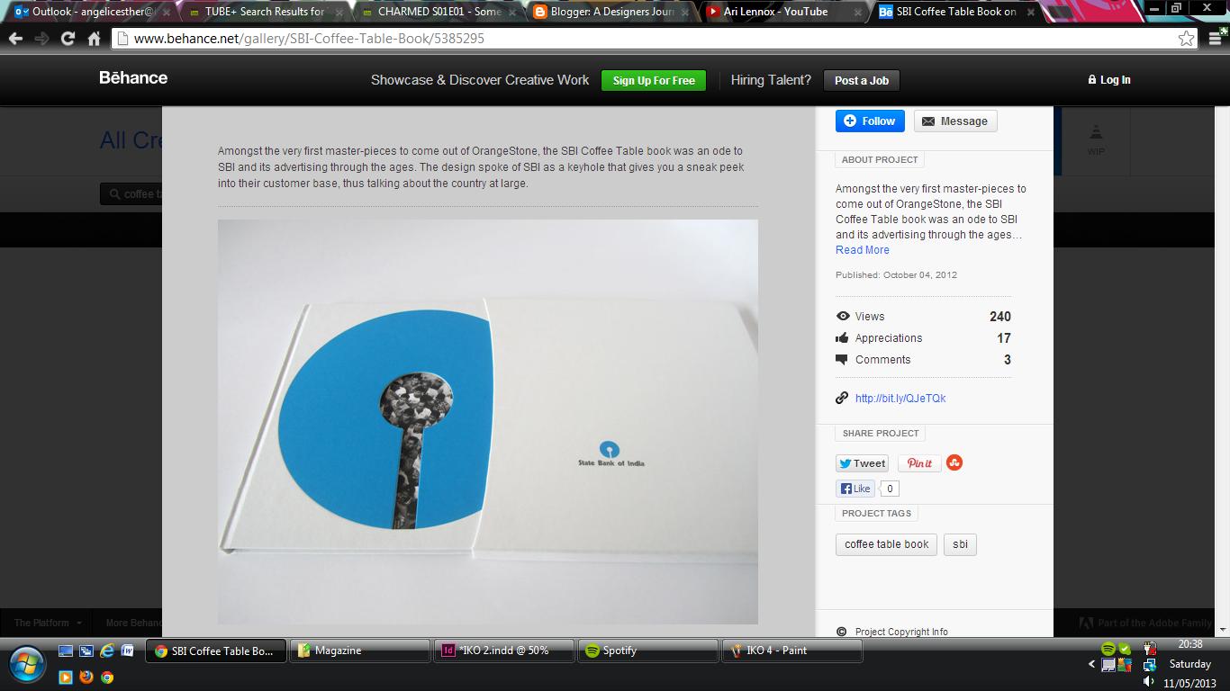
As you can see, the coffee table book is full of white space and the content is sparse. Most of what the viewer is expected to look at is the aesthetics rather than the information. Turning my magazine into a series of coffee table books sounds like a very interesting idea. I'm going to attempt this before the deadline!

(9) Vintage

Researching Vintage Style and Design


Now that I know I want my magazine to be slightly vintage, I've been researching a range of artists, styles and font in order to gather some ideas for my new layouts. I've been looking at different kinds of layouts most of all!
Lately, I've been a very much inspired by the designs of modern art editors rather than the classic ones. I think that I'd rather have a  magazine that some vintage elements but with a modern layout. For example, I'm going to keep all of the images black and white, sepia etc and experiment with a variety of 1940-50s fonts. I've been looking at colour palettes firstly. This is so that I have an idea as to what colours will stand out on my magazine. Here's an example of the sort of palettes I've been considering:
  

The font that I have been looking at have been tall, thin and slightly condensed. I really like this look and I think it could appeal to wide audience seeing as it doesn't look too old fashioned. I'm going to try and experiment with a few of the fonts that I have found and see what happens with them. 


Friday 10 May 2013

(8) Artists Block!

Redesigning IKO


My magazine so far hasn't been going in the direction that I want it to. So, I've decided to recreate my entire idea and design. One of the main reasons for my change in the designs is that I want my magazine to have some solid and obvious consistency. I've gone to the library a few times to have a look at some layout and magazine design books. I desperately need some new inspiration before I get started! 


I picked up a very useful book called The Last Magazine. This book has given me a great deal of ideas to try out. A lot of the designs I've seen in the book so far, look easy to mimic and recreate. So, I'm going to attempt some brand new layouts and see what happens!

(11) Front Cover Ideas?

Front Covers

I've finally made a start on some front cover Ideas for my magazine. I quite like the idea of create a front cover that isn't as clustered as modern day magazine covers. Vintage magazines all have very little wording on the front cover. The photography or illustration was usually inviting enough on it's own! That's exactly what I want from my front cover. Here are some examples of what I'm talking about:

   
I started a few experiments and quickly decided on a final cover. This was the cover that my tutors and peers thought suited the magazine best. I think the cover's quite basic. There isn't much to it and the theme is consistent throughout the front and back. You can see that I tested out the look and measurements of the front  cover on an existing A4 magazine. 


So far, I'm happy with the cover. The colours and photography give the audience an idea what to expect inside which is good. It could be a lot more exciting, but simplicity is what I'm going for. 

(10) Second Attempt!

Second Set of Ideas

I've decided to give the magazine another go and try something different. Instead of cluttering up my pages, I'm going to try and simplify things to make it look less busy. I've been trying to create pages with plenty of white space and a lot of emphasis on the layout rather than image. Here's an example of what I've started working on:


I'm going to attempt a few more experiments and see if I can form some kind of consistency or theme throughout my magazine. So, I'm feeling confident about the red strip photo but I could try and make something a bit more exciting!

Wednesday 8 May 2013

(7) Looking For Photographs!

Photography


I need a photographer! I've been contemplating on the idea of hiring a photographer, talking some photos myself or asking for of my old Photography friends for some thumbnail images in the mean time. I have an idea of what sort of photography I want. I would like images that are clean but have a vintage and stylish look to it. 
I've been doing a lot of research into photography lately. I came across an amazing talk via TED.com and discovered a photographer who believes in receiving equal rights for the LGBT community. Her photography is raw, natural and exactly the sort of style that I'm looking to create for my project.  


This image especially is sort of style that I'd like for my magazine. It's clearly a modern photo but the style and effects in the photography make it look like something old and vintage. I like this sort of look and I'm hoping to find a photographer who can supply this sort of photography for my magazine. 

You can see that majority of her photos are black and white. They're candid and beautiful in presentation. They also have an almost vintage feel to it. 

I've also been research an old photographer called Sir Norman Parkinson. I came across his photography a while ago when searching for vintage images. Here are some examples of his photography:


"Parkinson's brilliance has everything to do with time, and defying it – for he managed to be something that should be logically impossible, a "timeless" fashion photographer whose art danced through the decades and always remained in style.
Born just before the first world war, Parkinson lived through a century of extreme change and yet his pictures did not get relegated to yesterday's model. He defined the look of Vogue in the mid-20th century with pictures like his monochrome shot of a thin lady in a very wide hat. Surely, style like that should have made him old hat when the 1960s, miniskirts and sex blew 50s elegance out of the water, yet Parkinson took stunning images that captured the revolution of the 60s. His 1960 photograph Traffic, Queen is a phenomenal distillation of the new spirit. A woman is posed in front of a moving bus: in a typical Parkinson device, she is in sharp focus while everything else is allowed to blur. The bus becomes an abstract mass of speed – Parkinson's use of colour is scintillating, with the slender model wearing a red cap and black dress and leaning against a black and white pelican-crossing signpost."

(6) First Set of Designs!

My First Attempt


I'm trying out a few layouts of my magazine and so far, I'm not as pleased as I want to be with my designs. I don't feel as though I have an structure with it. However, I'm only trying out a few experiments and enjoying the process so far. Here are a few images of what I've done so far:


This image shows a design of what I wanted to use as an editors page. I wanted something similar to the designs of Baron but it didn't come out how I wanted it to. The page was supposed to be crowded with the large words, however, after looking back at it a few times, I'm not completely satisfied with it. 


This next spread is something that I attempted in the beginning of my research. I wanted something slightly vintage but still modern. To some extent, the spread does have a vintage feel but the image on the right clashes with everything! The colours are also quite dull, so I need to research some colour palettes. 


These next few spread are my attempt at a contemporary layout. I tried to do something with some of the photographs I had and it's starting to go somewhere. I think that I just need to find some kind of consistency is my layouts. Because I'm still not entirely sure what I want for my magazine, my designs are all over the place. I'll draw up some new ideas!


(5) Researching Fabien Baron

Fabien Baron


I've been researching an artist known as Fabien Baron. So far, he has become one of my favourite artists in the editorial design sector. His work is very abstract but still well accepted among the mainstream audience. I've seen a lot of his previous work in old Vogue issues and some websites. Here are some examples of work that he's done:
You can see that Baron is a huge fan of large headings and lettering. This is something that I'm hoping to incorporate into my designs. I like the idea of crowding an entire page with a title and or just a simple letter and photography. It's clean but still contains a wealth of aesthetically qualities to appeal to a large audience. This is exactly what I'm hoping to incorporate into my magazine. Here's some information I've found out about Fabien Baron:

"Fabien Baron is well known as one of the leading creative directors of our time. Vanity Fair magazine has called him “the most sought-after creative director in the world. Great names in fashion flock to him to bring a certain cool, understated elegance to their public images.”
"Condé Nast soon moved Baron to Milan, Italy, to redesign Italian Vogue in 1988 under editor Franca Sozzani. After a year and a half, he returned to New York to become creative director of Interview magazine during its 1990 relaunch. He turned Interview into a showcase for the best in contemporary photography, illustration and typographic design.
In 1992, the late editor-in-chief Liz Tilberis asked Baron to join her dream team to reinvent Harper’s Bazaar. His elegantly innovative new design and creative direction earned the magazine two Ellie’s, the most esteemed award in the magazine world, from the American Society of Magazine Editors"

(4) Researching Hans J Barschel

Hans J Barschel


I've been looking at a few artists as part of my research for my editorial project and I came across an Art Editor known as Hans J Barschel. He's not the most popular magazine designer, but I've seen some examples of work that he's done. Here are a few examples:


I quite like the complexity of his illustrations but they're not the kind of designs I want as part of my project. The work he's done for Harper Bazaar is interesting but not soft enough for what I'm looking to achieve. I've decided to keep examples of his work as a guide and inspiration for the time being. I've also found out some interesting infromation about him:

"Barschel's own promising career as a freelance designer and art director for the Deutsche Reichsbahn came to an end when he decided to leave Germany himself, eventually landing in New York City with few prospects. A fortunate connection with the entrepreneur and graphic arts patron Dr. Robert Leslie led to many commissions, and Barschel soon found himself in high demand. His innovative cover designs for Fortune, including the celebrated German U-boat "torpedo aiming-sight" image, established his reputation as a designer of imagination and with an eye for relevant detail. His covers for Town & Country, Alegheny Ludlum Steel Corporation's Steel Horizons, along with many dust jacket designs for publishers, helped him flourish during a period described by Dr. Leslie as the "creative forties." His circle of friends and design influences included Will Burtin, Paul Rand, George Giusti, Lucian Bernhard, McKnight Kauffer, and Joseph Binder. Later in the decade, his career moved in another direction and he began to design progressive graphics for the pharmaceutical firms of CIBA, Sharp, and Dohme and La Roche.
Moving to Rochester, New York in the early 1950's, he taught art and design at RIT, moving the program towards a modernist visual communications curriculum. His achievements were recognized through many awards, and his career has been documented in numerous periodicals, including PM Magazine, Arts & Industry, IDEA, and Gebrauchsgraphic. -- DP"
From the information I've gathered so far about him, Barschel is very well accomplished as a graphic designer but not specifically as an art editor. I'd like to find more artists that are accomplished specifically in art editing. 

Tuesday 7 May 2013

(2) Names & Mast Head

Naming The Magazine

I had the option of creating a series of spreads for an existing magazine but I decided it would definitely be more interesting and challenging if I created my own magazine. It gave me the chance to come up with a name and my own complete style for the magazine. 
For the last week and half, I've been drawing up a list of ideas for a magazine name. Names have been a bit of on issue seeing as most of the obvious names have already been taken. Here's a small part of this of names that I came up with during the week:
RIOT!
Pump
Kandy
M83
Anthem
Aztec
Sahara
Rouge
Bleu
Blank
Blanc
Monroe
1992
Ombre
Dame
Cheri
It's taken me a while to come up with something original and easy to remember. I wanted something that has few syllables, short and straight to the point. I came up another list of titles for my magazine a little while ago. After a quick chat with my tutor, I've settled on the name, IKO. It's Japanese for "let's go" apparently. I'm not entirely sure if the meaning is correct but I like the sound of the word and it's short and simple. 

UPDATE
So, I've been researching mastheads and have started designing a few ideas of my own. 
Here are some examples of the sort of mastheads I'm aiming to design:

Because I'd like my masthead to be simple but still interesting, I've decided to incorporate the idea of Japanese symbols into my design. Here are some examples of what I've been working on:

I used a very simple font and turned it 90 degrees in order to get a Japanese print signature look. I'm hoping that my masthead has that sort of look. Here's an example of what Japanese signature marks look like: