Front Covers
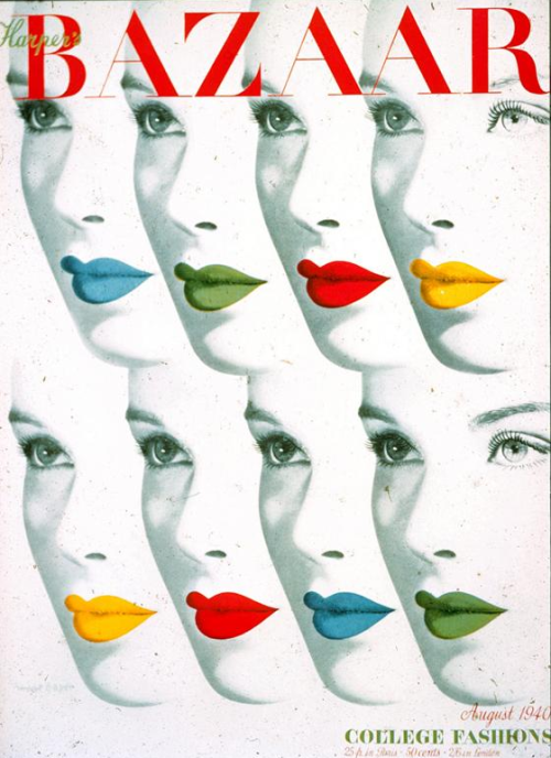
I've finally made a start on some front cover Ideas for my magazine. I quite like the idea of create a front cover that isn't as clustered as modern day magazine covers. Vintage magazines all have very little wording on the front cover. The photography or illustration was usually inviting enough on it's own! That's exactly what I want from my front cover. Here are some examples of what I'm talking about:


I started a few experiments and quickly decided on a final cover. This was the cover that my tutors and peers thought suited the magazine best. I think the cover's quite basic. There isn't much to it and the theme is consistent throughout the front and back. You can see that I tested out the look and measurements of the front cover on an existing A4 magazine.


So far, I'm happy with the cover. The colours and photography give the audience an idea what to expect inside which is good. It could be a lot more exciting, but simplicity is what I'm going for.
No comments:
Post a Comment