Friday 30 November 2012

7 Mastheads!

Creating My Own Masthead

I have been spending a great deal of time trying to create my own masthead for Velocity magazine. At first I was advised to create something that had pattern and texture. Possibly something with tyre tracks. I decided that before I went ahead with this idea that I would create a few initial ideas on Illustrator. They're definitely not anything solid, but simply a series of ideas that I might consider for my project. Here are a few images of some of the mastheads that I created. 


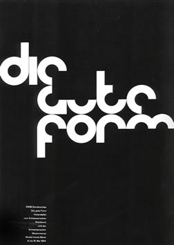
As can see, none of them are particularly interesting, however there are a few that I am looking to develop. I've been looking at contemporary magazines such as 1883, Varoom and Popshot so I can get a better idea of the sort of masthead I should be aiming for. Here are a few examples of the sort of mastheads by the magazines that I mentioned. 


One of my tutors has suggested that I go with something that contains tyre tracks and patterns so I went ahead and rode my bike over a sheet of A4 paper. Here's the result of my experiment. 


Those are the patterns that I ended up with and then coloured on Photoshop and illustrator in order to make them look more defined. I was definitely happy with the results of my patterns. The next task was to actually make them into some sort of masthead. I wanted to create something interesting and grungy. I also wanted my masthead to look almost abstract but still readable. I used illustrator to create a clipping mask with my font and this was my result. 
This is the result I ended up with on the first try. I wasn't very happy with the way it turned out due to its bland and plain appearance. I would have preferred it had a more vibrant texture. So, I experimented with colour and moving the words around tyres to give it a more abstract appearance. Here's what I ended up with. 


I was reasonably satisfied with the end result, however, I couldn't visualise any of the designs as an actual masthead for a professional and contemporary magazine. They weren't as vibrant and exciting as I would have liked them to be. Nevertheless, I did enjoy working with colour and texture. I've decided to leave this series of experiments and try something else instead. 


6 Editorial Project (Velocity)

Velocity

We've been a given a new project to start and this has been something I've been looking forward to since the beginning of the course. Editorial Design is something that has been of interest to me  over the past few years, so I'm going to ensure that I put my all into this module as I possibly can. 

The project is based on a fictional magazine known as Velocity which is all about biking and everything it involves. We've been given the task of creating a brand new masthead, cover and two spreads. 

I've been doing some brief research into the background of magazines and editorial work. Looking through other contemporary journals and gathering information about the designs. So far, I have a few ideas as to how I would like to approach this project. 

I'm very eager to create something that isn't photography based because it might be quite interesting to experiment with illustration and comic like images instead!

I'm certainly looking forward to this project and plan to enjoy it as much as I can seeing as it's something that I've looking forward to for some time. 

Sunday 18 November 2012

5 Finalising My Poster

Final Poster decision

Last year, when it came to final decision making, I was always wary about my choices. This held me back often, in terms of progress and graphic skills. This year, however, I've become a lot more  confident in my work and I make decisions based on my own judgement rather than mixed opinions from my different tutor. Although, I take their corrections and opinions into consideration, I felt that this time I needed to make up my own mind.
Here's an image of what my two final decisions were for my poster:

Unfortunately I haven't taken a focused picture of the poster I used as display. But, you can see I went for something that looked natural and basic seeing as Helvetica is described as basic and plain. I was satisfied with how it looked however I did receive some critique from my tutor. I was told to try something a bit more exciting and possible repositioning the letters again. So, I'm going to go back and look and edit the poster again for my professional portfolio later.
I may try creating a completely new poster for my portfolio or I may try and perfect this one. At the moment I'm not too sure. I still like the end product but before I put it in my portfolio, I'd like it to be as professional as possible. 

4 Graphics & Photography Collaboration!

Taking Pictures

In order to use the clay letters as part of my poster, I obviously needed to take pictures of them. I collaborated with another student who happens to be studying Photography. We both booked a photography room and took over 200 photos of my letters in various positions and layouts. The layout of the letters were inspired by Josef Muller and Armin Hoffman. The layout of their poster designs are quite simple and well structured which made it easy for me to mimic some of the styles using my letters.
Here are a few examples of what Armin Hoffman's posters look like.
  
As you can see, the posters are very type based and look very simple but still have aesthetic qualities to it. I tried to arrange my letters in the same layout as the poster while still creating different positions of my own. 


I experimented with more layouts than this and I'm quite happy with most of the photographs. I might trying another photo shoot with my letters but because of how close the deadline is, I'm going to have to settle for one the images that I already have. 

2 Working With "Blood"

First Experiment

I've started working on my first experiment for the Type Poster project and this is the blood and life idea that I had last week. I've decided to try and create something less complex instead but still work with the idea of blood. I chose to cut out the word "Type" from cardboard and use red paint to trace around the edges. The experiment was quite fun and the end results were interesting. Here are a few images what it looked like!


This was the final one I did when I decided I was finished with the stencil cut out. I didn't want it to go to waste so i covered it in blood and then stuck it to paper. The dripping blood effect was exactly what I was hoping for! 


This is the first experiment I did with my stencils. I simply painted around the edges and hoped that the excess paint would create a dripping effect but unfortunately it dried too quickly and this is what I ended up with. 


This was created in a spur of the moment. It was an accidental piece but I ended up using the mess to my advantage. I splashed some paint on my stencils while it was on paper and decided to continue splashing in order to see what it might look like. This is what I ended up. It's messy but still somewhat readable. 

Overall, the experiment was not exactly what I had in mind but the end results were very interesting I didn't think that any of the designs would come out the way it did. Will definitely consider it for my final poster. 

3. Bringing Letters To Life!

Working With Clay

This is my second experiment for the Type Poster project. I've been looking forward to this idea for a while because I've so eager to design something in other areas of art. 
For this experiment  I cut out the letters that spelt Helvetica. It was a time consuming process but I'm almost happy with the end result. Here's what it looked like after I cut some of them out! The shapes were slightly jagged and the some of them fell apart but I still satisfied with the end result. 
Perfect shapes aren't exactly what I was going for. As long as the actual shapes are readable and still neat, it's okay. I've never worked with clay before, so this was a very exciting part of the project for me! I wanted to make more words and our tutor suggested that I create more using a quote or a more exciting word other then Helvetica, so I went ahead and researched into quotes on clay and dullness. I found this quote:

"if you say that someone you admire has feet of clay, you mean they have hidden faults"

I thought that the last two words of the quote worked perfectly with my clay letters! My cut outs are slightly jagged, not perfect and neither is Helvetica. I decided to cut out the words Hidden Fault and see what they look like instead of Helvetica. I painted a few of them red because Helvetica is a Swiss design and Swiss graphics are know for using red as their identified colours. Here's how my clay letters turned out.
I thoroughly enjoyed making them and they came out quite quirky yet still corporate to some extent. Because I spent so much time on this part of my project, I decided that I'd use this as the graphic for my type poster graphic. Seeing as I'm not creating a digital illustration, I'm quite curious to see what this might look like at the end of my project. 

1 Poster Design

Poster Design

For the next five weeks I'm going to be focusing on creating a poster for the Design Museum. This is basically an extension of our summer project based on typography and it's history. For my poster, I have decided to focus on illustrating the history and common opinions of Helvetica in my poster. Helvetica was the typeface that I spent most of my summer researching so I thought it would be appropriate to base my poster on it. 

So far I've only been able to rustle up a few ideas in my sketch book nothing particularly interesting has come to mind. For this project I'd really like to avoid using the computer as much as I possible can. This is because I believe that Graphics is more than just the digital process! I'd like to dabble in other areas of art in order to create my poster. Helvetica is known for being a simple and elegant font that's easy to read, common and corperate. Some have even gone as far as calling it "Dull", "Lifeless" and "Dead". 
At the moment, these are my current ideas

  • Sowing the word helvetica into cloth
I saw a design like this done by a previous design student last year and thought that I might experiment in this area (fashion & textiles). 
  • Creating 3D letters and covering them in thin red paint.
The red paint will represent blood and the 3D letters will represent liveliness. The whole piece will simply illustrate my thoughts on Helvetica and how I disagree with the opinion that "it's lifeless". 
  • Creating stencils and looking through the space.
Helvetica is also known as being "transparent" due to the fact that it's such a commonly used font that people hardly notice it anymore.
  • Creating my letters out of clay and then covering them in thin red paint. 
This is similar to my 3D letters idea. I'd like to try it with clay too because of how the print makers used to press letters into clay before modern production. Clay could also represent life in the same way Christians believe that the body was formed with clay.

I'm looking forward to the project!