Taking Pictures
In order to use the clay letters as part of my poster, I obviously needed to take pictures of them. I collaborated with another student who happens to be studying Photography. We both booked a photography room and took over 200 photos of my letters in various positions and layouts. The layout of the letters were inspired by Josef Muller and Armin Hoffman. The layout of their poster designs are quite simple and well structured which made it easy for me to mimic some of the styles using my letters.
Here are a few examples of what Armin Hoffman's posters look like.

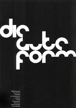
As you can see, the posters are very type based and look very simple but still have aesthetic qualities to it. I tried to arrange my letters in the same layout as the poster while still creating different positions of my own.


I experimented with more layouts than this and I'm quite happy with most of the photographs. I might trying another photo shoot with my letters but because of how close the deadline is, I'm going to have to settle for one the images that I already have.
No comments:
Post a Comment