Template Gothic Research
I have started researching into the history and orientation of the Template Gothic Typeface. This was definitely the most difficult typefaces to research due to the fact it is one of the latest typeface's to date. It's unfortunate that I couldn't find much information via the internet, so I will be making a trip to Bower Ashton Library in search of extra information.
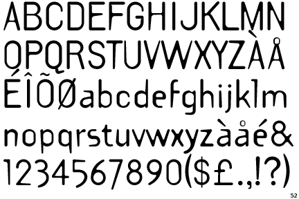
So far, The creator and Designer of Template Gothic is Barry Deck. Here's an image of what Template Gothic looks like:
I found this interesting quote from a website, describing the digital era of typeface and design during the nineties. "In the early 1990s, as digital design tools began supporting the seamless reproduction and integration of media, many designers grew dissatisfied with clean, unsullied surfaces, seeking instead to plunge the letter into the harsh and caustic world of physical processes. Letters, which for centuries had sought perfection in ever more exact technologies, became scratched, bent, bruised, and polluted."
Due to the ever changing interests of the design world, Barry Deck was able to use this as inspiration in order to create something rough and grungy. I know that the nineties was a very rough and grungy era in search of something different and Barry Deck's typeface design certain fit into the era appropriately.
The image above perfectly illustrates what the nineties were about and the cultural change in the western world. Things were more rough and daring and I love how the image about titles the entire design as "I am not perfect"/


No comments:
Post a Comment