Helvetica Typeface
Lately, I've been researching the history and orientation of the Helvetica typeface. Before the beginning of our summer break, we were encouraged to pick a typeface that we found the most interesting and do some more in depth research into it. I've decided that I might focus my attention on the Helvetica typeface.The reason for this is because the Helvetica typeface is one of the youngest typefaces I've research so far. This means that it's quite modern and possible a lot more interesting to research. Here's some information that I've discovered about the Helvetica Typeface.
"The original Helvetica was designed in Switzerland in 1957 by Max Miedinger and Eduard Hoffmann at the Haas type foundry (Haas’sche Schriftgiesserei). Haas was controlled by the type foundry Stempel, which was in turn controlled by Linotype."
The original name for Helvitica was actually Die Neue Haas Grotesk. It was closely based on a typeface knows as Schelter-Grotesk. The typeface was created to be something safe and basic. "This neutrality was paramount, and based on the idea that type itself should give no meaning"
The original name for Helvitica was actually Die Neue Haas Grotesk. It was closely based on a typeface knows as Schelter-Grotesk. The typeface was created to be something safe and basic. "This neutrality was paramount, and based on the idea that type itself should give no meaning"
Here's an image of what the Helvetica Typeface looks like:
"Helvetica is one of the most popular typefaces in the world. Technically speaking, it’s a sans serif Grotesque typeface, inspired by and based on the Akzidenz-Grotesk typeface created by Berthold around 1898."
This is an image of the original Helvetica Brochure:
Here's an interesting fact about how the name came about "The marketing director at Stempel decided to change the name to Helvetica in 1960 to make the font more marketable internationally. Originally it was proposed that the typeface be called Helvetia (Latin for Switzerland), but the designers didn't want to name it after a country, and so it was called Helvetica instead (which is Latin for Swiss)"
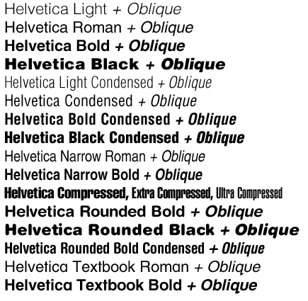
There have multiple variations of Helvetica; some eve created by other type designers.
Helvetica was originally designed during the post war in Europe and many companies were looking for a change. People had become bored of the swirly and fancy looking typeface and so they wanted something more corporate, modern and stronger.
- Helvetica Light was designed at Stempel by artistic director Erich Schultz-Anker and Arthur Ritzel.
- Helvetica Compressed was designed by Matthew Carter that’s similar to Helvetica Inserat, but with a few differences.
- Helvetica Textbook is an alternate design with a few different characters.
- Helvetica Rounded was developed in 1978 and includes rounded stroke terminators. It’s only available in bold and black versions (including condensed and obliques), plus an outline version that wasn’t available digitally.
- Neue Helvetica was developed in 1983 and has more structurally unified heights and widths among its characters. It also has improved legibility, increased spacing in numbers, and heavier punctuation marks.
Helvetica was originally designed during the post war in Europe and many companies were looking for a change. People had become bored of the swirly and fancy looking typeface and so they wanted something more corporate, modern and stronger.

According to my research, Helvetica can be compared to the typeface, Ariel. Here's some information that found written by Cameron Chapmen:
Compared to Arial
"Arial is a very similar font to Helvetica, and was developed in 1982. To an untrained eye, the differences between the two fonts is almost undetectable. But there are key differences among certain characters, notably G, R, r, t, a, and 3. I Love Typography has a great comparison of how Arial and Helvetica differ. Helvetica is somewhat more refined than Arial, even though each one has the same character width. One of the key differences, though, is in the strokes for each character. Helvetica uses primarily vertical or horizontal strokes, while Arial often uses diagonal strokes. If you’re interested to see if you can tell the difference between Arial and Helvetica, Ironic Sans has a quiz that compares 20 popular logos originally designed with Helvetica redone in Arial and compared. It’s harder than you’d initially think, particularly if those characters mentioned above (with key differences between the two fonts) aren't present in the logos."
I found this quite interesting because at first glance, I would not have noticed the similarities between both of the typeface. But when placed side by side, you can see the tiny modifactions in certain letters.
No comments:
Post a Comment