Baskerville Type Research
Recently, I've been researching into the history and development of the Baskerville type design. Before I started looking into it more specifically, I had already done some brief research into it due to the fact that Giambattista Bodoni had used this typeface as inspiration for his design, Bodoni. This type face was created by an artist known as John Baskerville.
"Baskerville, designed in 1754, is most known for its crisp edges, high contrast and generous proportions. The typeface was heavily influenced by the processes of the Birmingham-bred John Baskerville, a master type-founder and printer, who owed much of his career to his beginnings". After some thorough research into the history of this typeface, I came across a short list of the characteristics of Baskerville. These are points that I probably wouldn't have been able to notice myself:
Identifying Characteristics
- tail on lowercase g does not close
- swash-like tail of Q
- small counter of italic e compared to italic a
- J well below baseline
- high crossbar and pointed apex of A
- top and bottom serifs on C
- W and w have no middle stroke
- long lower arm of E
- Many version feature a calligraphic J
- T has wide arms
Here's an image of what the Baskerville image looks like.

I haven't yet looked into some important key words for my typography project. But according to my research the Baskerville typeface was something developed due to technology and was known as a transitional typeface. "John Baskerville. Baskerville, who had made a fortune in japanning before turning to printing when in his mid forties, was responsible for several advances in printing technology, improving press platens and packings, formulating darker and faster-drying inks, and inventing wove paper, which was smoother than the old laid papers with their vertical ribbing. all of this enabled him to employ a typeface with sharper definition and thinner elements than was previously possible. This marks the move from the "garalde" to the transitional faces."
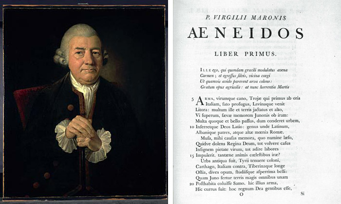
This is an image I found of is earliest works used in books.
"Baskerville is categorized as a transitional typeface in-between classical typefaces and the high contrast modern faces. At the time that John Baskerville decided to switch from owning a japanning business to a type foundry, Phillipe Grandjean’s exclusive Romain du Roi for Louis XIV had circulated and been copied in Europe. The mathematically-drawn characters felt cold, and prompted Baskerville to create a softer typeface with rounded bracketed serifs and a vertical axis." Like many of the other type designers I have looked at, John was inspired by another typeface to create his own.
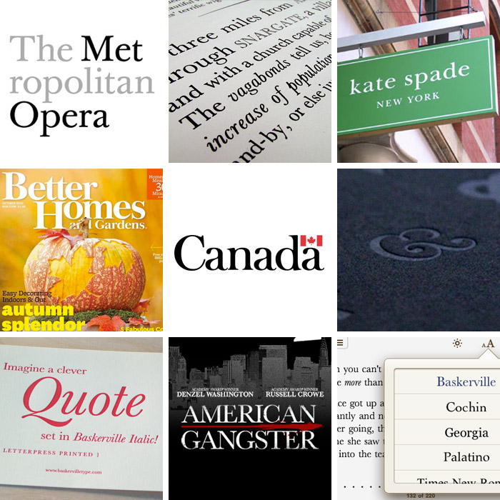
Here's an image of how Baskerville is used in today's modern works:
No comments:
Post a Comment