Gill Sans Research
After doing some brief research, I found quite a bit about the Gill Sans typeface and its background. Gills Sans was originally created by a man known as Eric Gill (Born in Bristol) and was also issued by Monotype in 1928-30. He was inspired to create this font while working for his employer and friend known as Edward Johnston, the creator of the London Underground typeface.

"Gill Sans rose to popularity in 1929 when it became the standard typeface for the London and North Eastern Railway (LNER), appearing on everything from locomotive nameplates to time tables."
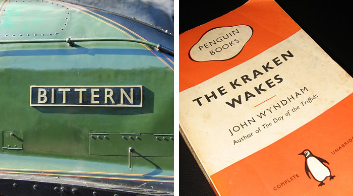
"The typeface was used in 1935 by designer Edward Young on the now iconic Penguin Books jacket design, putting Gill Sans on bookshelves around the world."
Gill developed his font a lot more when advertising agencies and businesses became more demanding of unique and distinctive fonts. Here's an image of the family of fonts that he created.
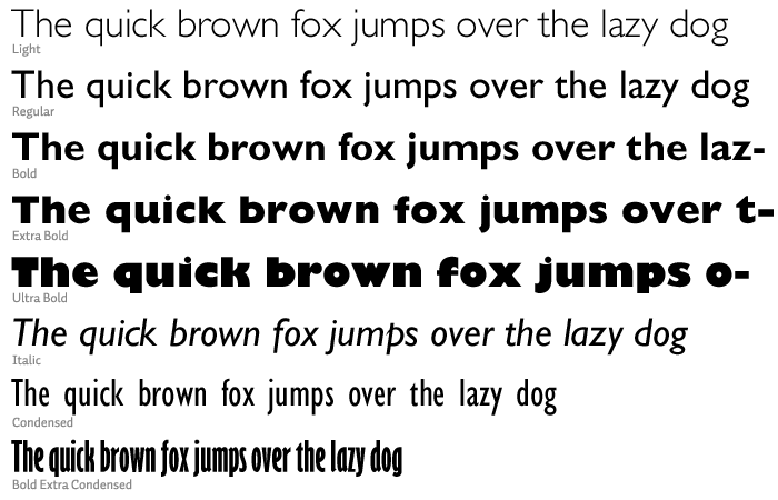
He explained that his reason for doing this was because "The Gill Sans family ranges from Light to the exaggerated Ultra Bold—“because every advertisement has to try and shout down its neighbors,"
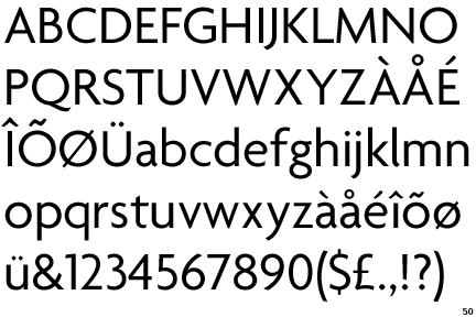
Some further researched has shown me that the Gill Sans font also has some classic Roman proportions to it. This is so that it doesn't have too much of a mechanical feel to it.
I went ahead and did some brief research on Edward Johnston in order to find out what influenced Eric Gill. Here's an image of a short series of the typeface he created for the London underground logo. You can see that his designs are quite similar to Gill Sans.
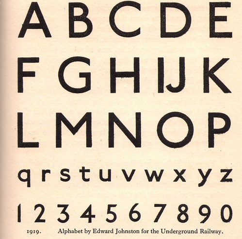
You can see how Gill was able to Johnston's designs and create his own by simple adding a few modifications. I recently read a blog that explains how Eric Gill only used a few adjustments to in order to create his unique font. It explains, "Similar to Johnston’s sans serif, Gill Sans is more refined and distinctive. Eric Gill replaced Johnston’s diamonds over the ‘i’ and ‘j’ with round dots He also simplified the lowercase ‘l’ in comparison to the hooked ‘l’ in Johnston’s alphabet. Notable differences in the uppercase include the open counters in Gill’s ‘S’ and the humanistic stroke and joinery on the tail of the ‘Q’. Gill Sans has points at the base of the ‘V’ and the ‘W’ in contrast with the flat bases of Johnston’s letters"
So, by only adding a few adjustments to his designs, he was able to create a completely new typeface of his own. We still use the typeface today and I did some brief research on this fact. Here's a quote from http://idsgn.org/posts/know-your-type-gill-sans/ that I found interesting.
"Today over two dozen Gill Sans designs are available digitally, with mainstream reach thanks to its inclusion on Mac OS X and Microsoft Office. It can be seen everywhere, used (or overused) on everything from corporate logos to movie posters—one industry that has actually embraced the unusual Ultra Bold."
No comments:
Post a Comment