Research, Reading & Illustrator Designing
After our typography seminars, we were given a two week project to complete over the Christmas holidays I've gone ahead and conducted some research of my own in order to find out a bit more about typography. We needed to add information given to us during the seminars plus the information we gathered ourselves. I used the internet a lot more than books because I felt that it was easiest source I could get to for information at the time. I was able to find a sufficient amount of historicals facts that I think is relevant to the project. I'm hoping that what I am including in the poster will not be useless because I did collect an abundance of information therefore, I'm unsure as to whether or not I should include it.
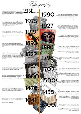
 In terms of designing the timeline, I was unsure as to how I should present my information, what it should look like and what I should include in the poster. I have finished the poster a little while ago but I am still unsure about the presentation. It's plain, simple and you can see the information clearly. I was unsure whether or not I needed to add a wealth of images therefore I decided to only add relevant images that related to the most important facts. Here, you can see my Typography History timeline.
As mentioned before, it's quite basic and looks very simple. I wanted to make sure I was including more information rather than images because we told to give information.
If I had a little extra time, then I would go back and redesign the entire timeline to make it more aesthetically pleasing. But if I did make it look more interesting then I may not have had enough space to add information. I
Before I even started designing the timeline, I did some research in timeline designs and here are some of the designs that appealed to me the most. This first one seemed to make the most sense to me so I wanted to create a timeline similar to it. It's plain and does what it's supposed to do; present information.

This next one is similar to the one yo see above. As I researched further, I noticed that most the timeline designs were all the same so I decided to lean towards the growing ages line design. I thought that instead of having my timeline horizontal like these designs, I would have mine vertical so that I'd have enough space to place information. At the time, this seemed to work best for me but as I researched further and found other images of timeline, I started doubt the look of my poster.

In the end, I decided that the information I added would be from the seminar and from the information that I gathered myself. Although I am not entirely happy with the way I designed my timeline, I prefer it this way because I have presented more information that images.
No comments:
Post a Comment