Magazine and Book Layout Designs
These past couple of sessions have been spent talking about book covers and magazine layout. This is something that I have always been interested in since sixth form. I've always been curious to know how books and magazines are published and what goes in to the production before creating an entire book cover. For the next few weeks, we will be working on some book covers and magazine layouts of our own. I'm going to be using a few magazines and books as inspiration.
Last week, were instructed to pick some titles out of a long list given to us and these were the tiles I chose to use because U assumed they would be the easiest to work with:
Because I have grown so used to designing with a computer over the past years, I have decided to try and continue working in my sketch book and layout pad using only pen and paper so I can learn to draw and plan better. Here are some images I of the lard thumbnail sketches I did before I decide to design them on the computer.
So far, I'm quite enjoying Book cover designing even though I haven't gotten round to designing anything totally solid on the computer. I'm sure I will be able to create something by the end of this week using Illustrator and Photoshop.
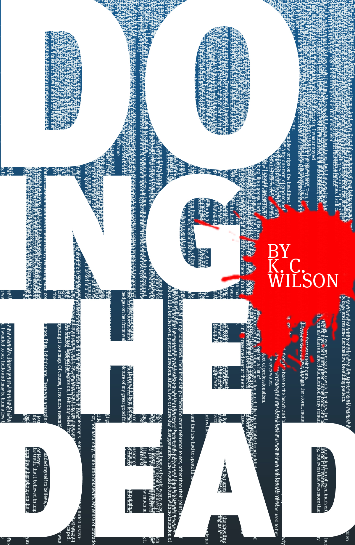
 I've also been researching a variety of Book cover designers these past few days and I've come across an urban artist know as Jeff Hendrickson. He designed a book cover that I cam across online during some research. The book was called "Doing The Dead"; you'll see it on his website. His work is all very commercial and professional which is something I might like to do one day but not right now. The book cover design that Hendrickson designed was very plain but still eye catching, which I liked. Here is a link to his Blog site: http://www.jeffhendricksondesign.com/blog/
Here is an image of the book cover that I saw.


Last week, were instructed to pick some titles out of a long list given to us and these were the tiles I chose to use because U assumed they would be the easiest to work with:
- COOL DUDES
- Haute Couture
- California
- Archaos
- Pop Art
Because I have grown so used to designing with a computer over the past years, I have decided to try and continue working in my sketch book and layout pad using only pen and paper so I can learn to draw and plan better. Here are some images I of the lard thumbnail sketches I did before I decide to design them on the computer.
So far, I'm quite enjoying Book cover designing even though I haven't gotten round to designing anything totally solid on the computer. I'm sure I will be able to create something by the end of this week using Illustrator and Photoshop.

Here is an image of the book cover that I saw.
This is the sort of cover I'm aiming for. Something simple and not to wild.
I haven't thought too much about magazine layouts yet because I've been concentrating a lot on book covers. I have photocopied and researched a variety magazine layouts that I want to analyse and use as part of my project.
Update:
I've started creating some front covers of my own because I was quite eager to get started. Here you can see that I have created my first book cover using Photoshop. This cover was created for the book title Cool Dude. It's very basic but I believe it subtly illustrates the title. I chose a black background because black is usually associated with gangs, night life, clubbing and all sorts of negative things. Then I chose make the letters connect to each other so that it would illustrate a group of close friends. The bright colours of the letters made it, I think, slightly more interesting to look at because busy colours is something that mainly associated with youth. The image beside it what I wanted to use in case I wanted an underline.


Magazines:
Because I needed some inspiration, I visited the Library on occasionally in order to find spread outs of magazines. I found a few layout Ideas from journals such as Creative Review and other journals. I chose to focus on the layout pages of creative review because this journal is the only one with square shaped pages unlike other magazines that have rectangular (A4) pages. I have not started my magazine layout analysis yet but I will conduct some more research so I'm sure what I'm doing.
Because I needed some inspiration, I visited the Library on occasionally in order to find spread outs of magazines. I found a few layout Ideas from journals such as Creative Review and other journals. I chose to focus on the layout pages of creative review because this journal is the only one with square shaped pages unlike other magazines that have rectangular (A4) pages. I have not started my magazine layout analysis yet but I will conduct some more research so I'm sure what I'm doing.
No comments:
Post a Comment