Initial Ideas For Spread
For this week of my project, I've been struggling quite a bit with ways in which I can approach my spread design and layout. I have not been sure about what kind of design I want to do and theme.
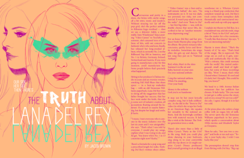
After some throughout research into magazine design layout, I have decided that I would like to exclude photographic images from my spreads and instead focus on creating an illustration based magazine spread. Here are a few examples of the sort of spread that I am hoping to achieve.
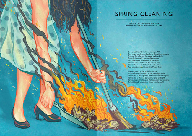
This is an example from the magazine, Popshot. Looking at the spread, I'm immediately drawn to the design and encouraged to read the article. I would like my spread to look something like this but with a much grungier and contemporary effect. I have been doing some research into the sort of spread that I would like to create. Here are a few examples of the sort of the design that I'm aiming for.


I found these after doing some research. None of them have any interesting layout but the way in which they use white spaces and spread the image across the pages is exactly what I'm going for. I would like to take advantage of white space and concentrate on actual design. At the same time, I don't want my image to be too overpowering.
I'm looking forward to progressing with the rest of the project! Hopefully my experiments will turn out well and I'll be able to develop them further.
After some throughout research into magazine design layout, I have decided that I would like to exclude photographic images from my spreads and instead focus on creating an illustration based magazine spread. Here are a few examples of the sort of spread that I am hoping to achieve.
This is an example from the magazine, Popshot. Looking at the spread, I'm immediately drawn to the design and encouraged to read the article. I would like my spread to look something like this but with a much grungier and contemporary effect. I have been doing some research into the sort of spread that I would like to create. Here are a few examples of the sort of the design that I'm aiming for.


I found these after doing some research. None of them have any interesting layout but the way in which they use white spaces and spread the image across the pages is exactly what I'm going for. I would like to take advantage of white space and concentrate on actual design. At the same time, I don't want my image to be too overpowering.
I'm looking forward to progressing with the rest of the project! Hopefully my experiments will turn out well and I'll be able to develop them further.

No comments:
Post a Comment